Relief
01 Susanne Piotter, 02 Amalia Valdés, 03 Ute Essig, 04 Eva Berendes, 05 Franz Küsters, 06 Michael Laube, 07 Cécile Dupaquier, 08 Karsten Konrad, 09 Frank Coldewey, 10 Bram Braam, 11 Frank Taffelt, 12 Jochen Mura, 13 Axel Lieber, 14 Katrin Otto, 15 Dieter Detzner, 16 Maria Muñoz, 17 Benjamin Gräbner, 18 Zora Janković
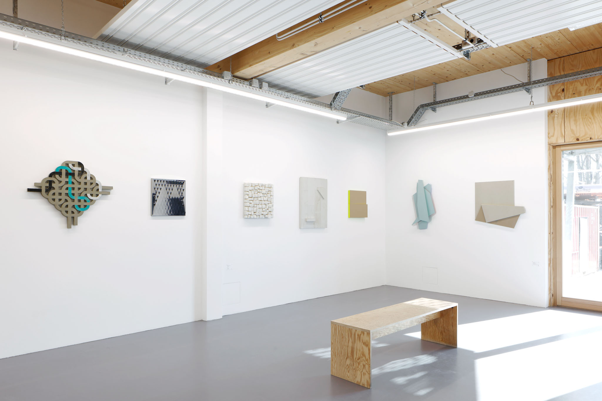
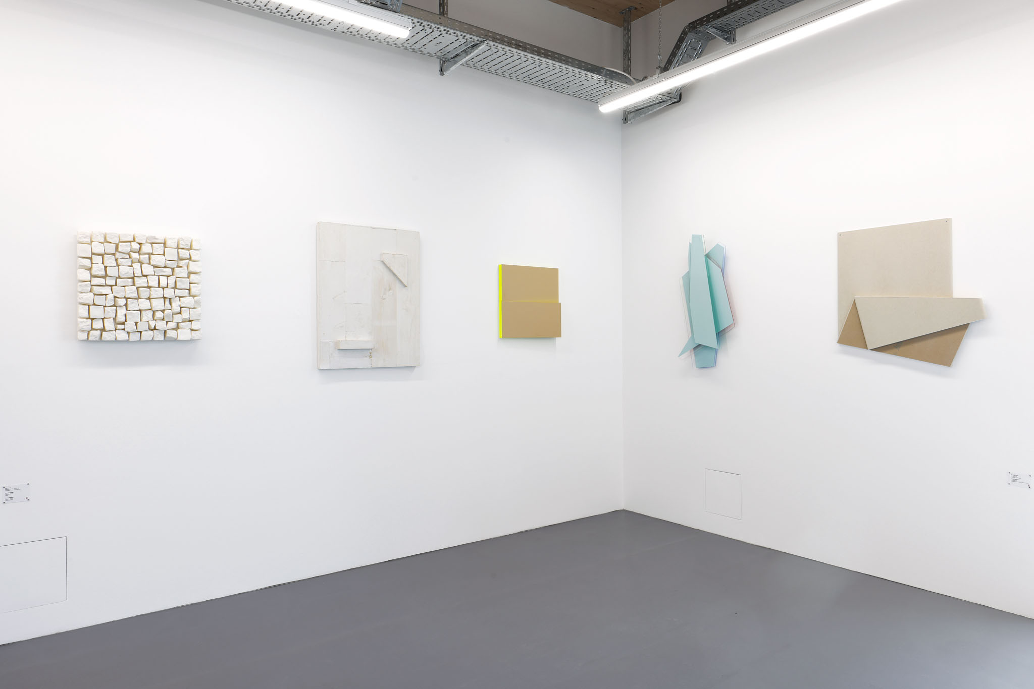

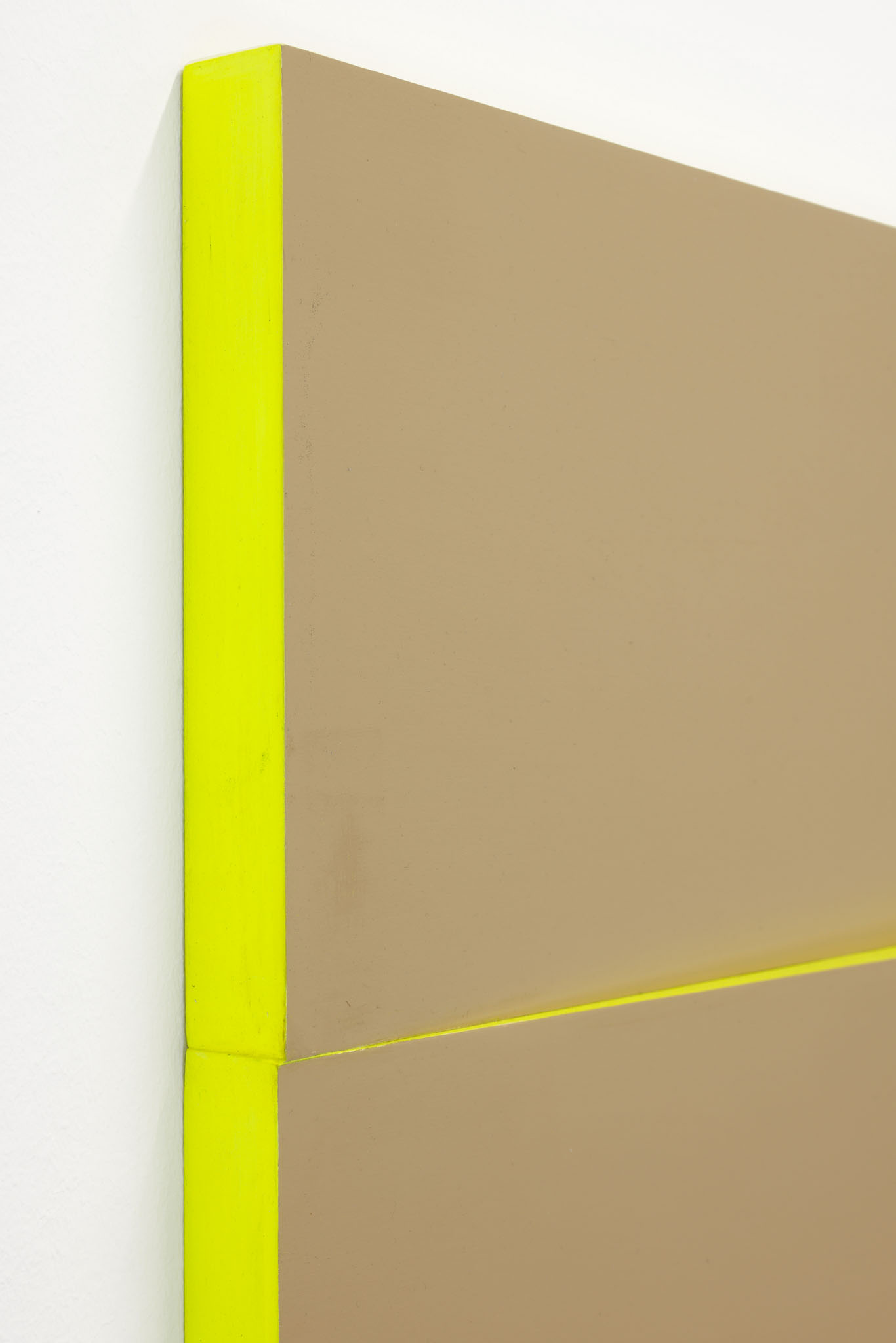
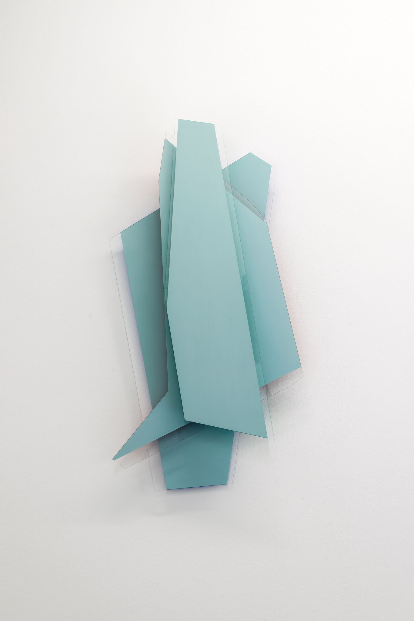
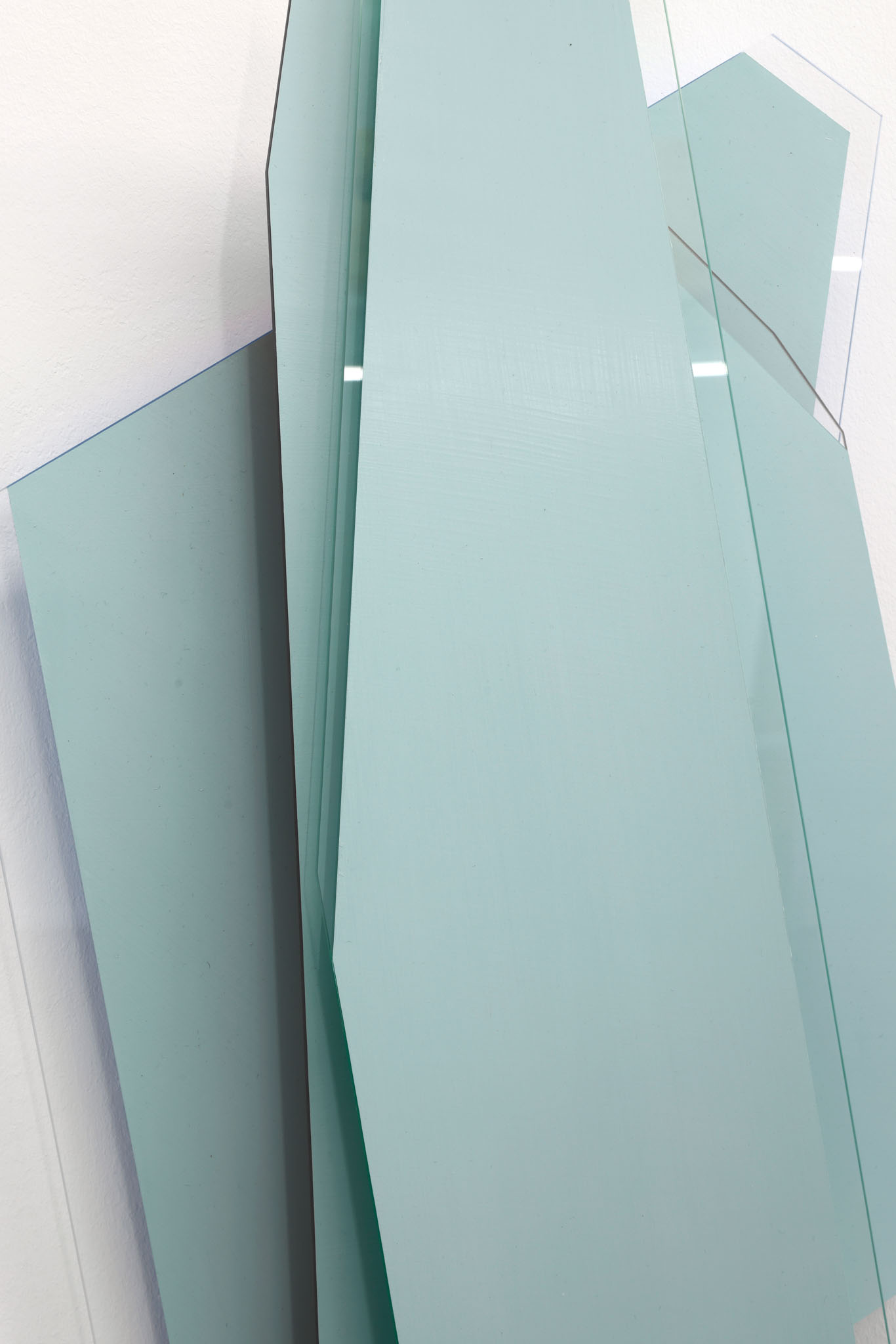
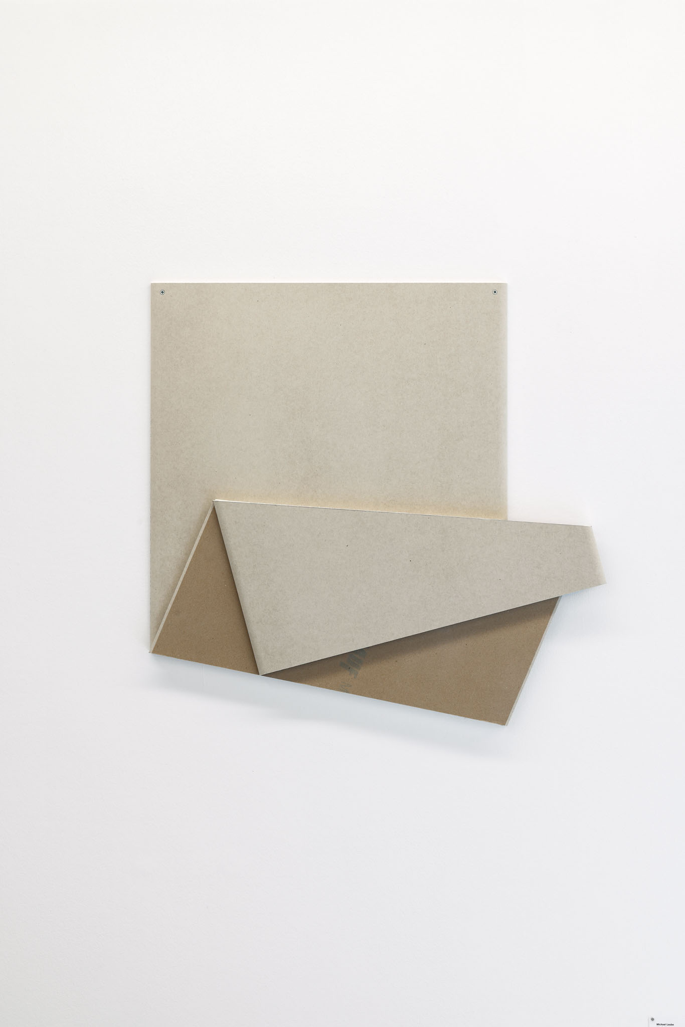
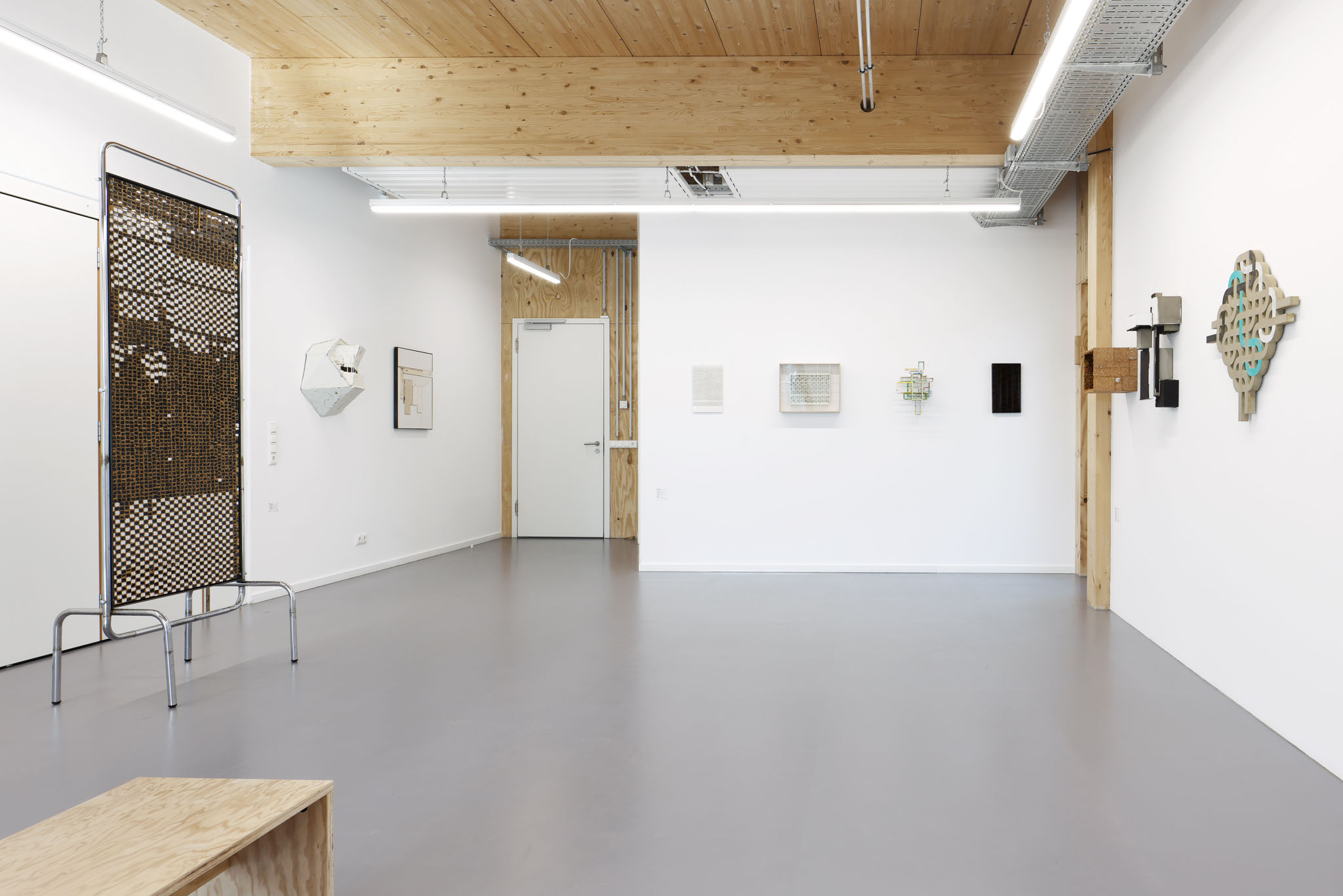

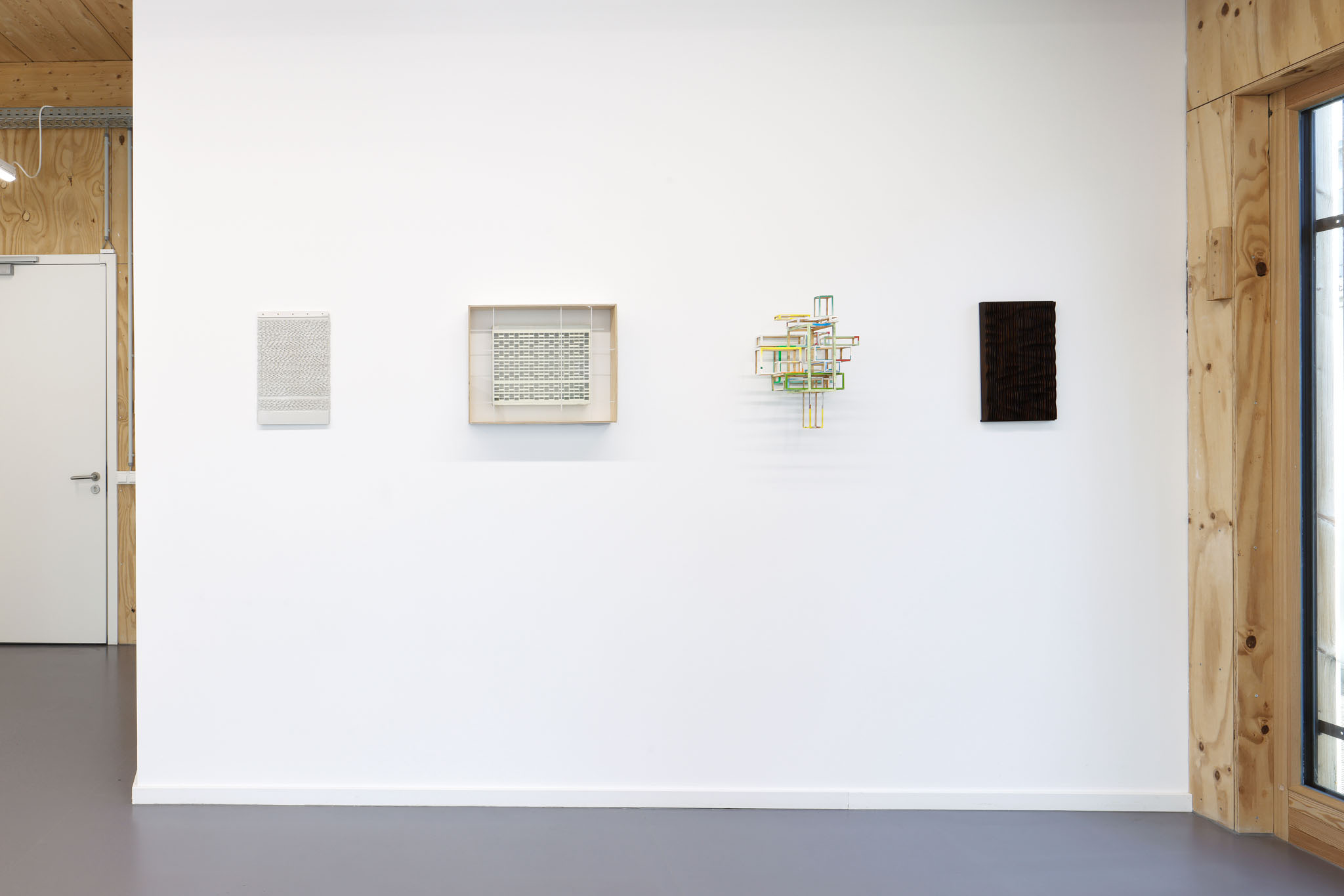
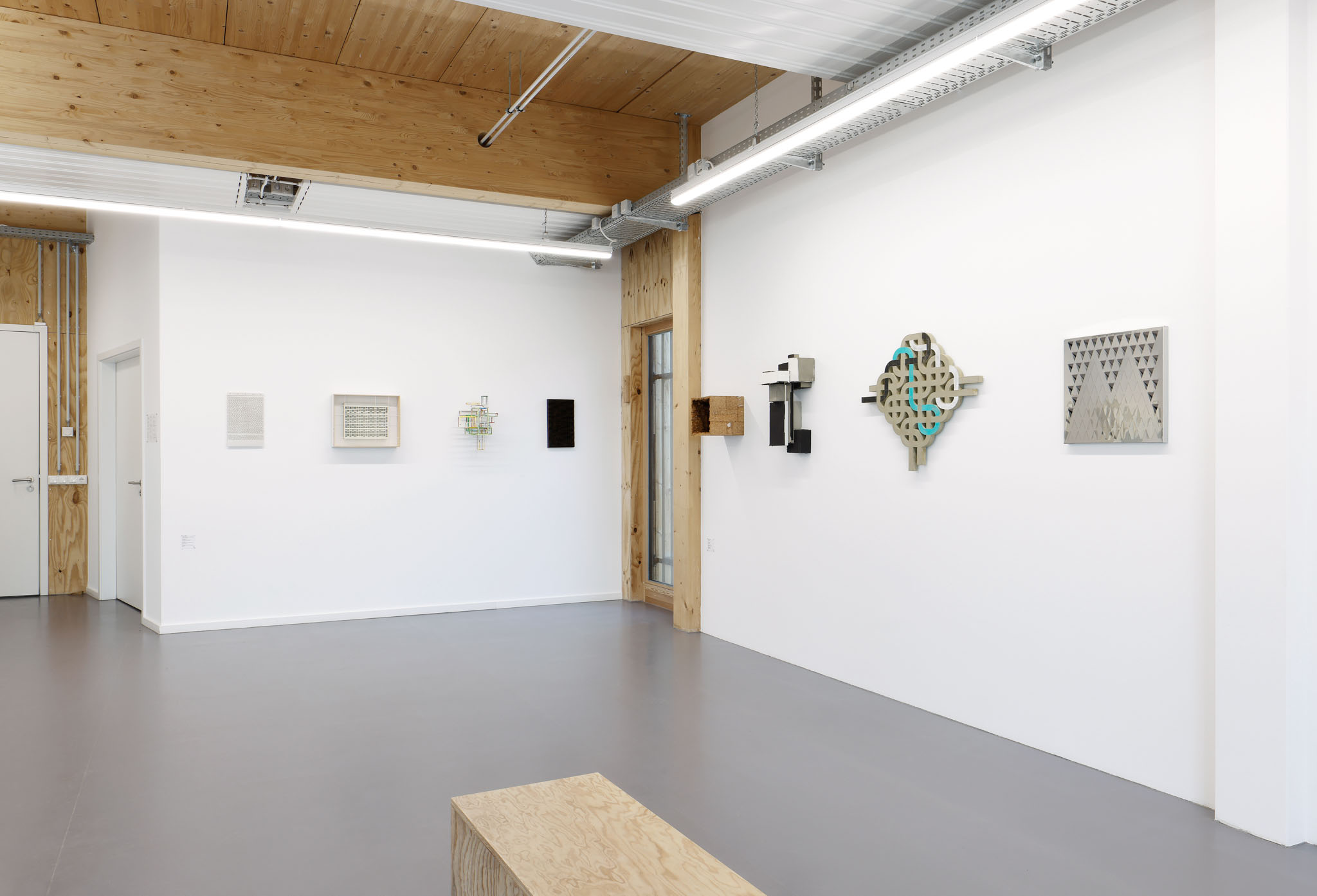
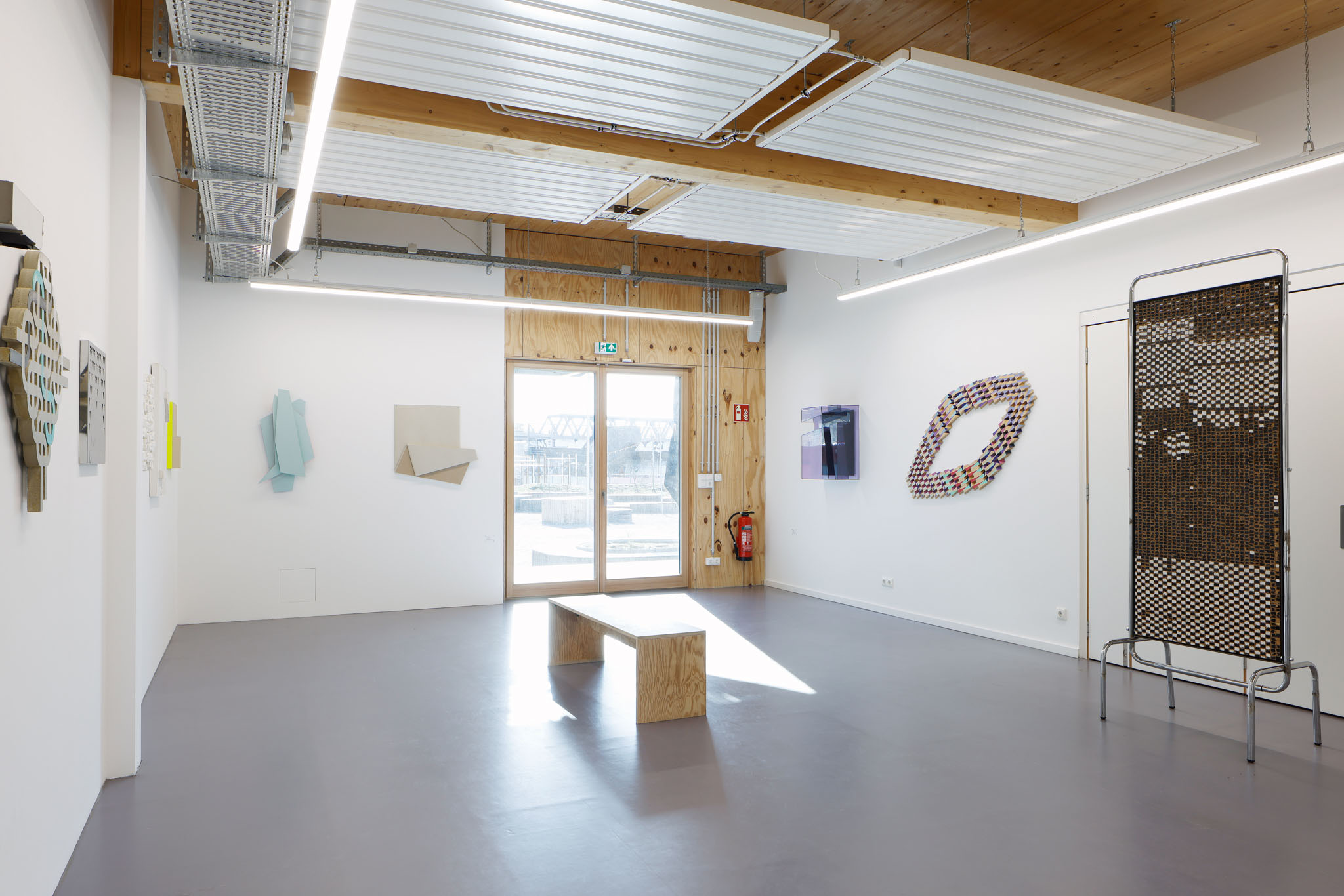
Relief can be located between sculpture and painting. Created from a surface or a body, it stands out plastically from the background, figurative or abstract-ornamental. The group exhibition RELIEF at "B-Part Exhibition" shows various current groups of works with reliefs, which show references to architecture, to the urban, to spatial concepts, but which also refer to each other through the material and form used. The play of light and shadow as well as apparent movements in the works, generated by their own change of position in the exhibition space, allow the relief to emerge as a contemporary form of artistic expression. Through the serial presentation, through the interplay of the works, RELIEF explores new definitions of the genre, distinguishing itself from sculpture or expanding it. A frieze emerges:
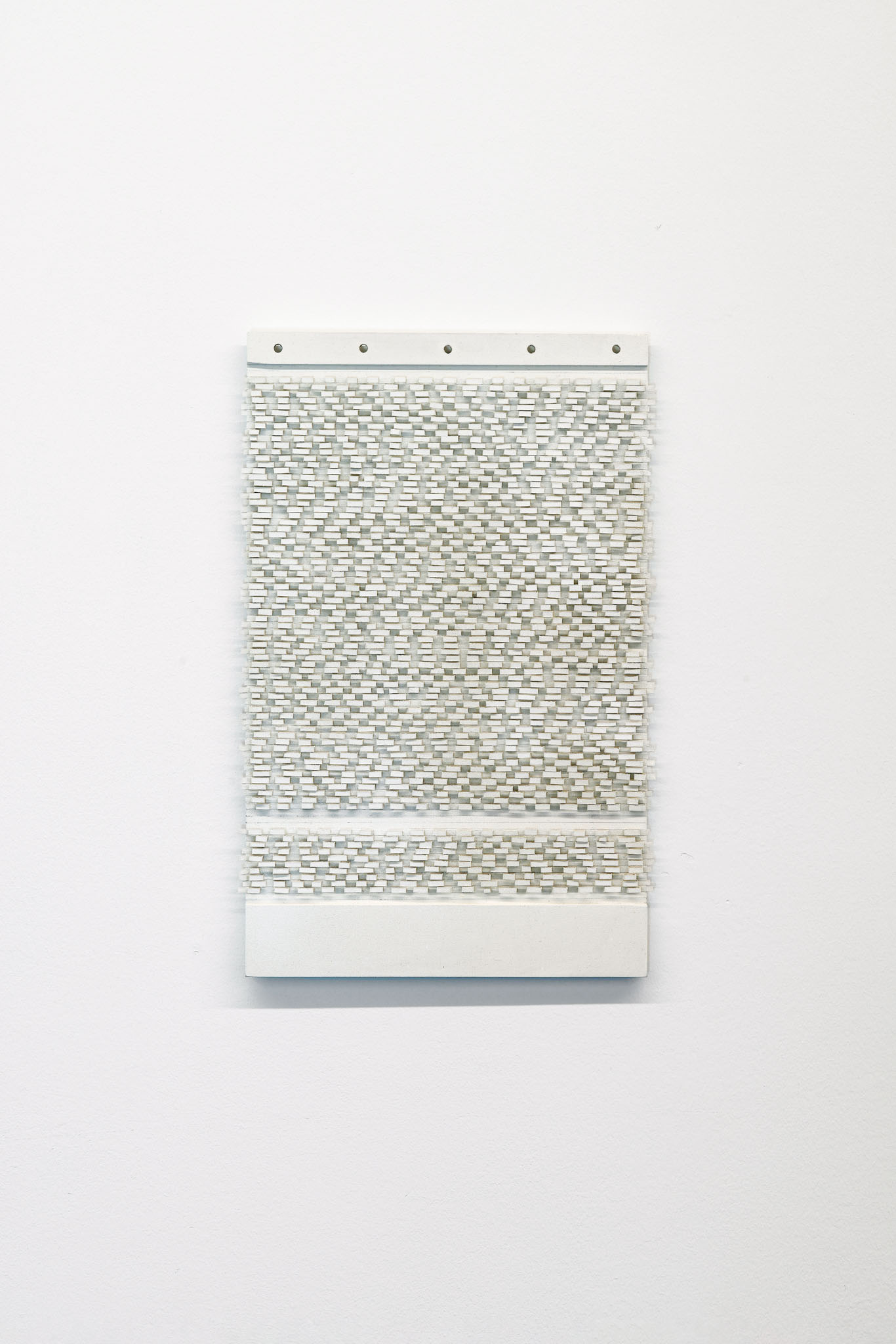
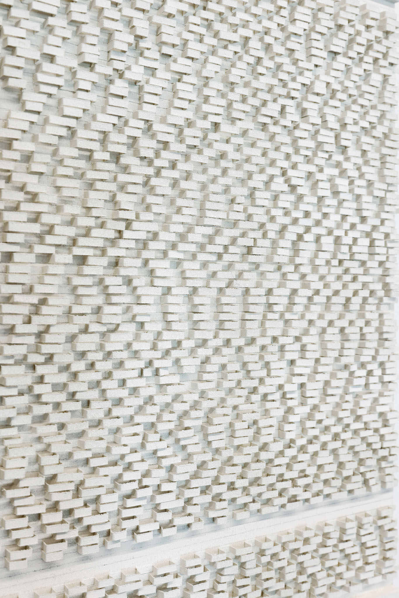
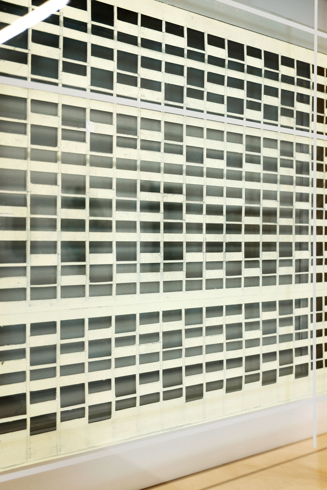
Frank Taffelt's work from his series "KB.S. [Nos. 17-24]" follows a reduced concept: three materials (wood, paper, metal), three orders (pencil, primer white, acrylic white), and multiplex plates with five holes in three thicknesses (9, 12, and 15 mm). Irregularly folded strips of paper, 3 mm wide, give rise to a plastic course with a relief-like surface and a strict architectonics. The rhythm resembles a code.
Based on architectural structures and forms, Jochen Mura assembles colorfully reduced, minimalist objects and installations from "simple" materials such as cardboard, wood, and acrylic glass. In his work from the series "The Fallibility of Insights" shown here, grids become the motif for supposed transparency in several respects, providing an interplay between foregrounds and backgrounds, of spatialities and surfaces.
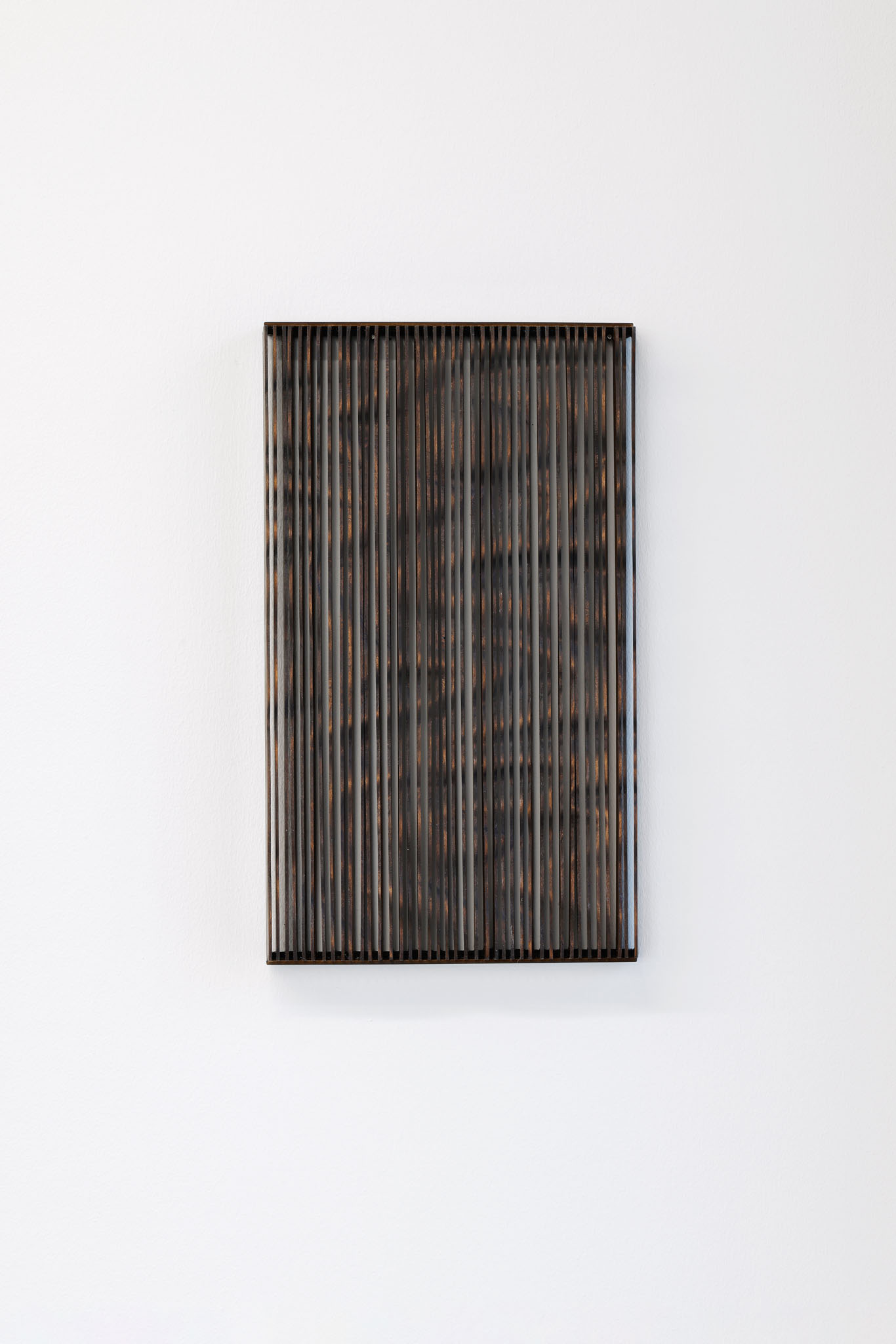
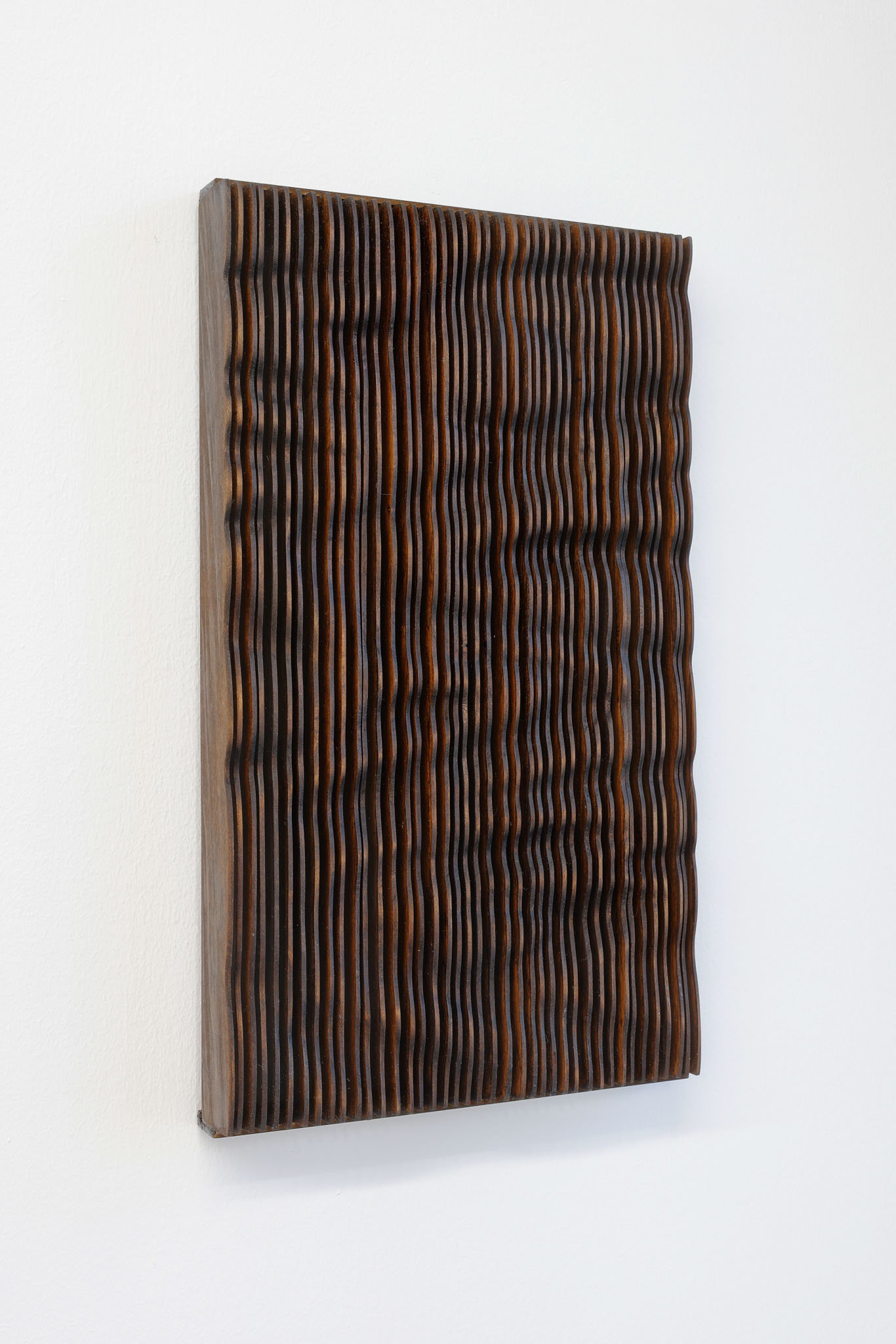
The three-dimensional topography of a fictional place is shown in Katrin Otto's wooden work "Fassade", which has a clear tendency towards architecture and spatial design. The segmented profiles, together with the irregular edges of the vertical slats, form an abstract organic relief; the mild gradations of light and shadow additionally create an almost iridescent spatiality, the haptic thus also becoming a perceptual relief.
Franz Küster's work is characterized by the fact that it combines abstract geometric reduction and visual-sensual diversity in the sense of concrete thinking. His works invite us to give space to our own perception. The work "Versatz" shown here oscillates between painting and object art. Through the simplest gesture imaginable - the displacement - it becomes a relief, but underscores this gesture through color towards a plastic image.
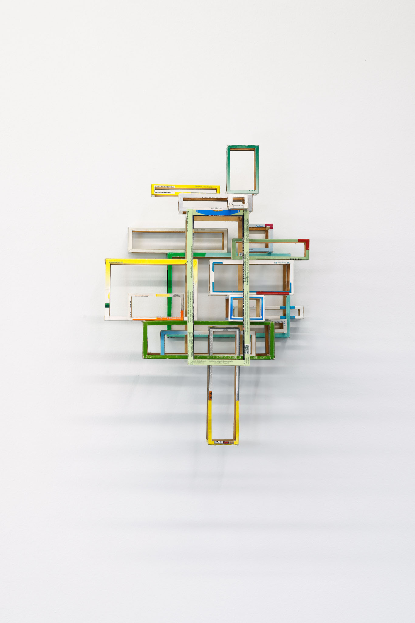
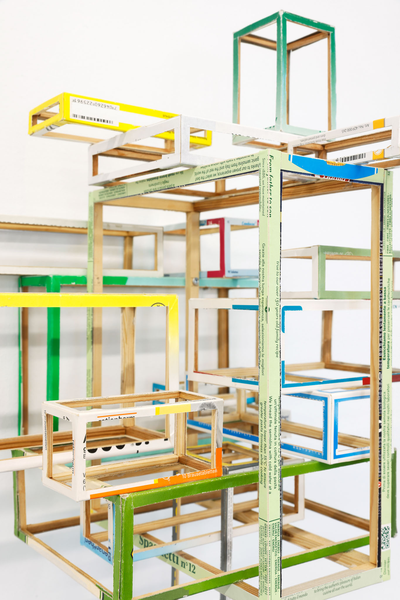
The fashion of "unboxing", the celebrated removal of a product from its packaging, which can be located in net culture, receives an update in Axel Lieber's wall object "My Constructive Everyday Life": Lieber "removes" the packaging from itself, leaving only a narrow edge that makes brand names still partly visible or guessable. Clustered into a colorful, fragile-seeming construction, the permeable everyday objects now define a non-ordinary space that could also serve as a late consumerist commentary on Lajos Kassák's concept of "pictorial architecture."
Rugged, straight, round, hollow, angular, bulky and supple form elements are what Zora Janković uses in her concrete works. In the interplay with the concrete elements, sometimes left raw by casting, sometimes smoothly flattened, her relief "S3R214", made of concrete and paper, also refers to the process of its creation. Questions about form and material arise: what is concrete, what is paper, in what way can the two materials be so similar, and what role does color play in the work's plasticity?
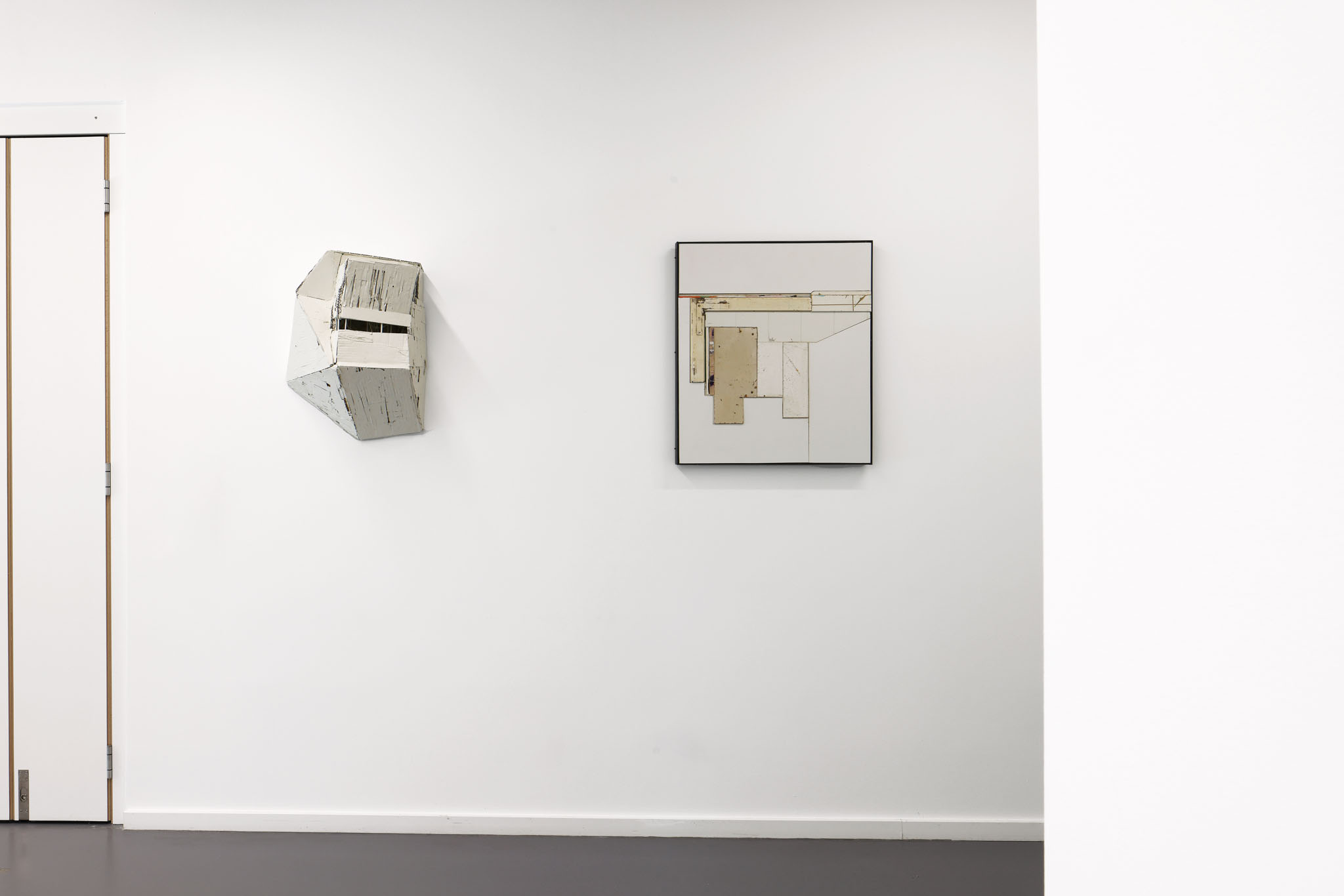
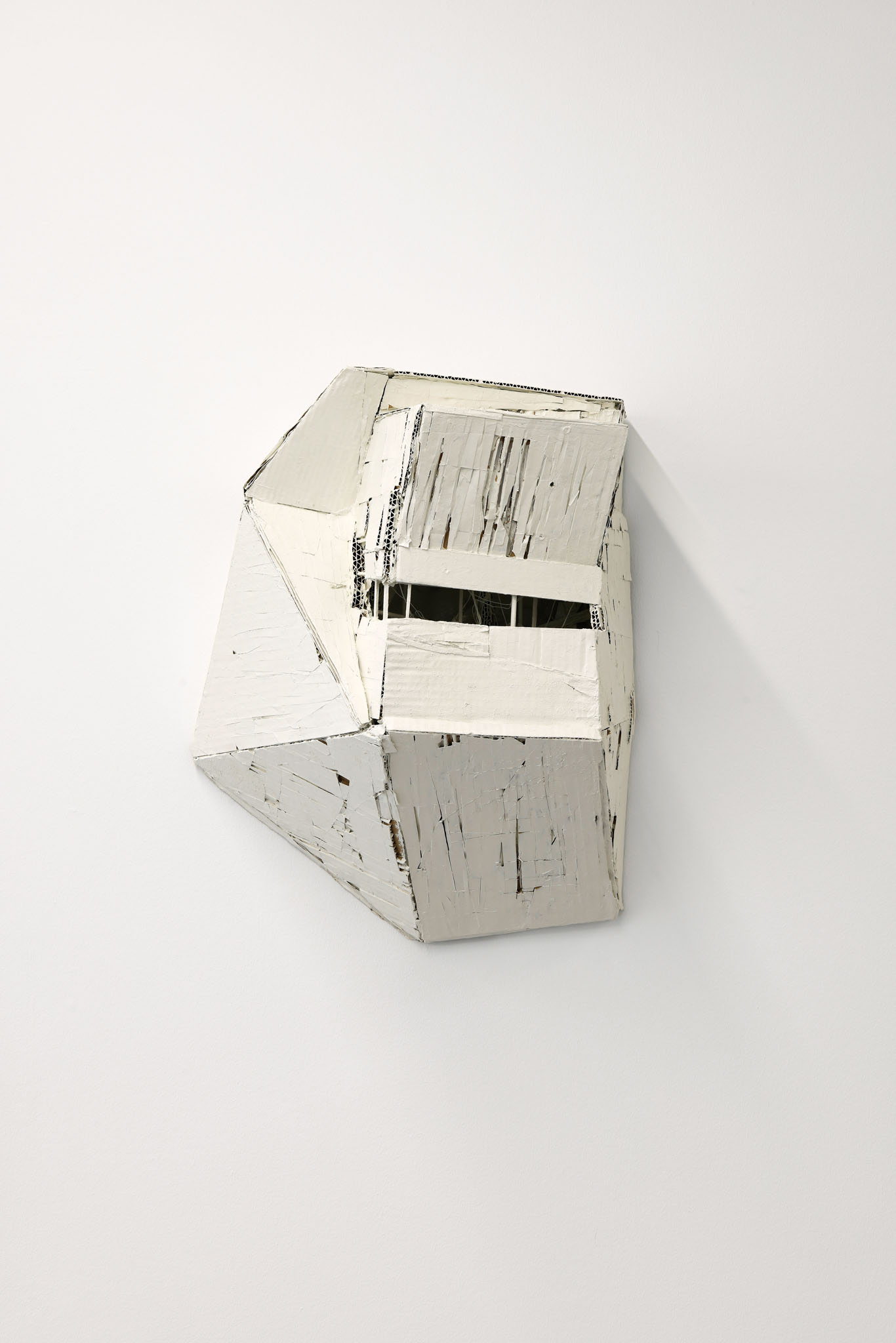
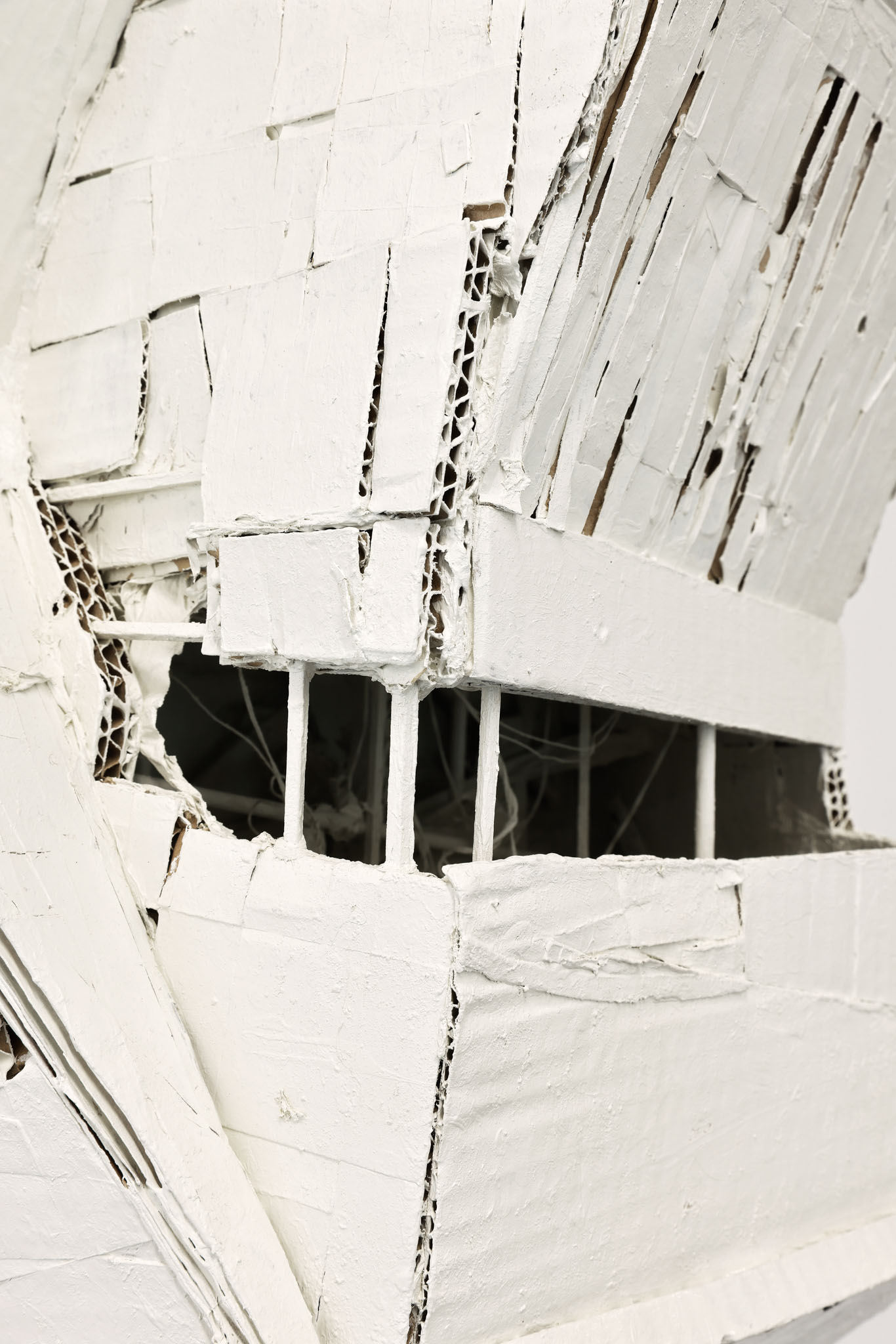
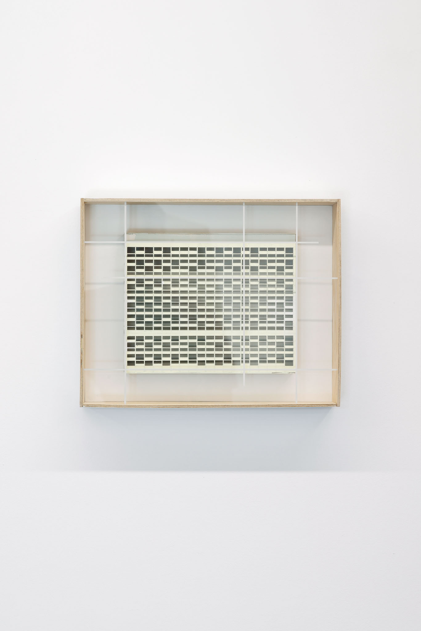
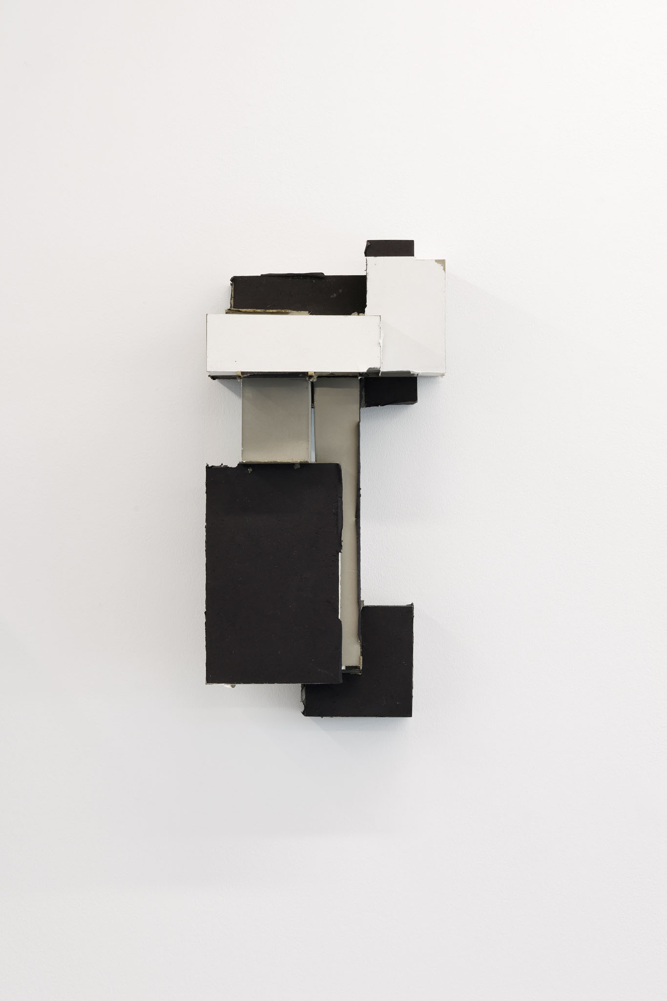
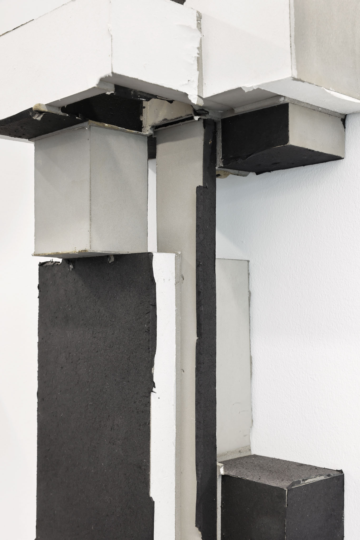
Hanging on the wall or protruding from the wall, autonomous object or architectural model? Frank Coldewey's "Relief (No. 32)" made of cardboard, paper, string, wood, painted with acrylic varnish, is reminiscent in form and exposure of recent architecture such as the Monte Rosa Hut in the Valais Alps; the impression of the simple materials and the partly brittle structure, however, make one think rather of a brutalist remnant, of an urban ruin.
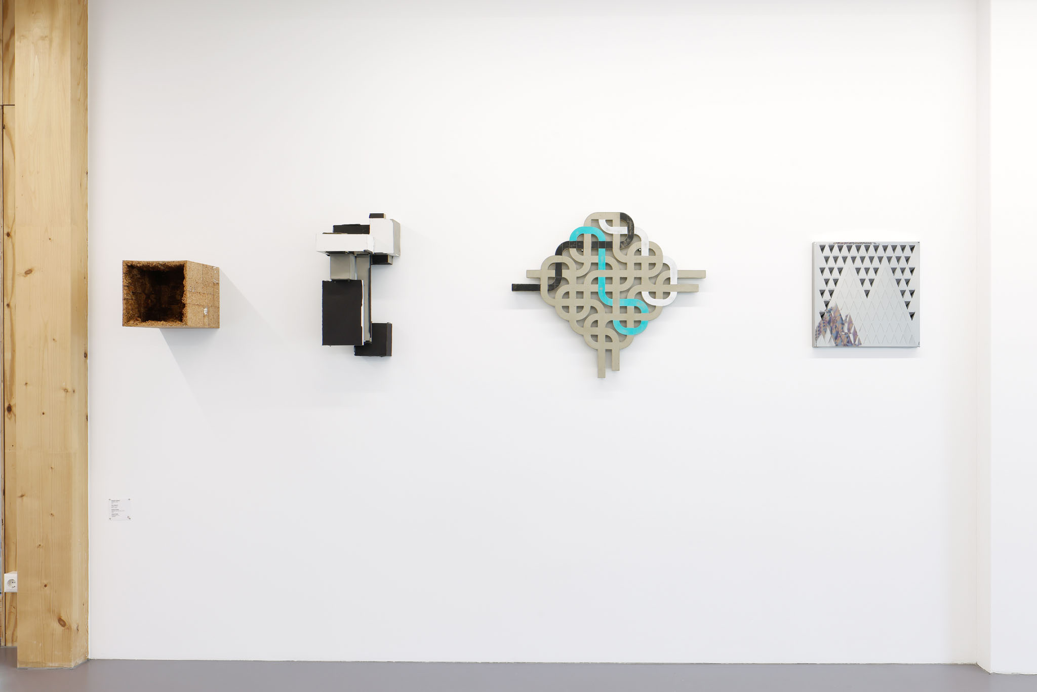
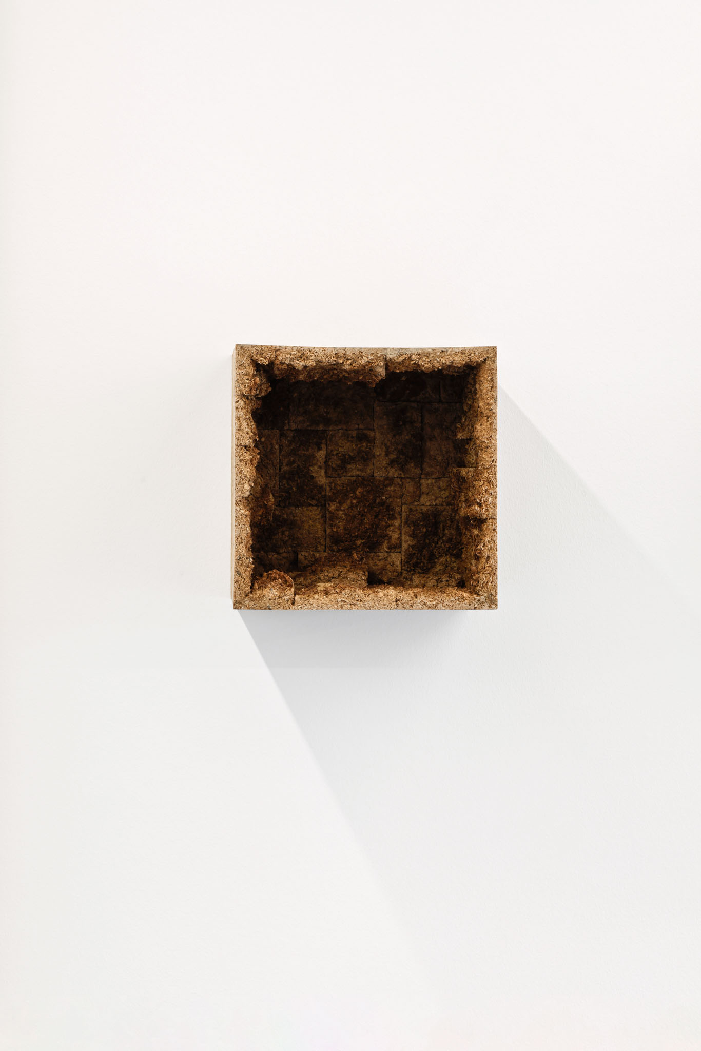
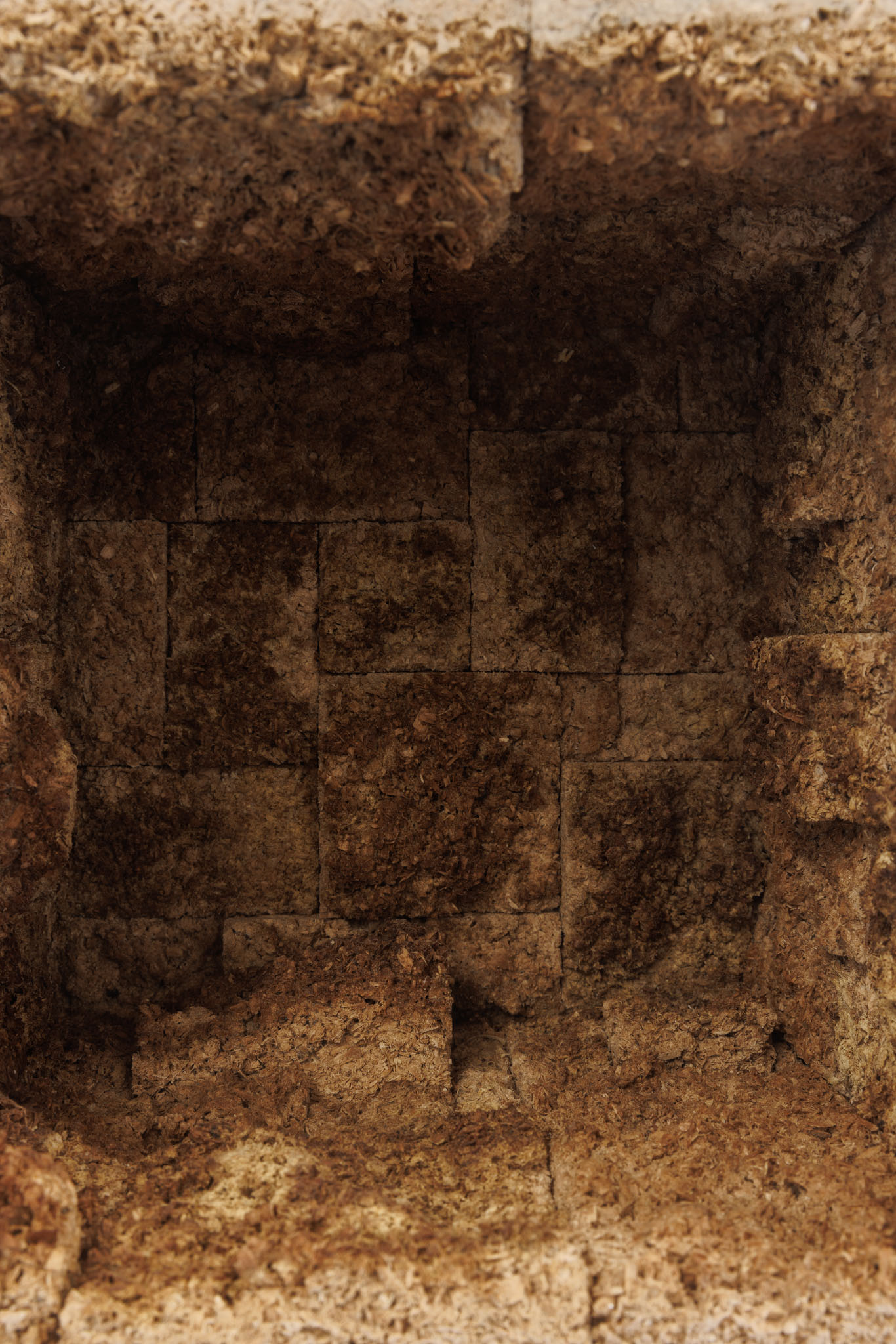
Benjamin Gräbner's sculptural wooden work "MOKEW" seems to partition space. The difference between the craggy interior and the smooth exterior of his cube, which is open to one side - ours - is a formal one in terms of design, which asks, among other things, about technique, tools, and gestural proof.
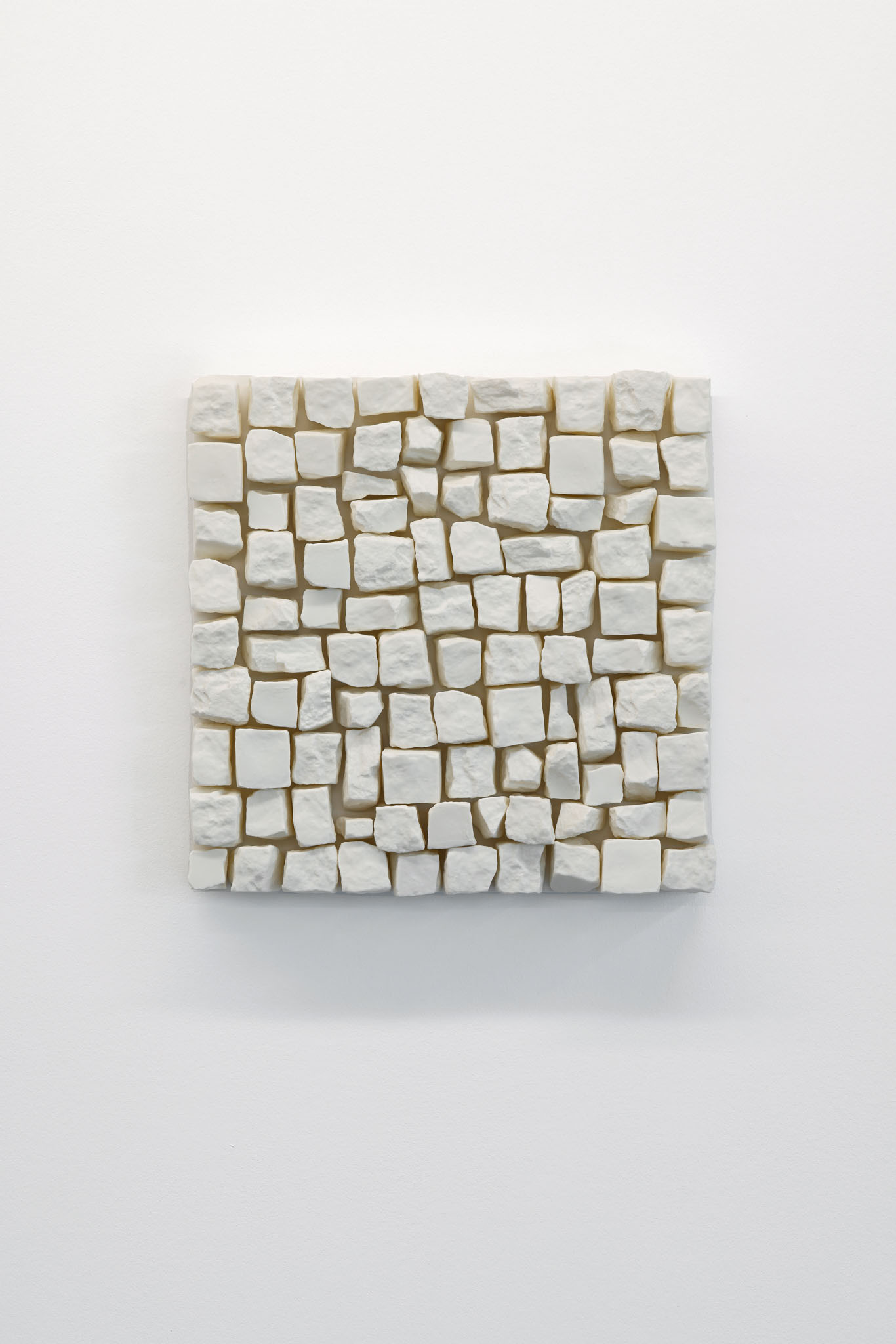
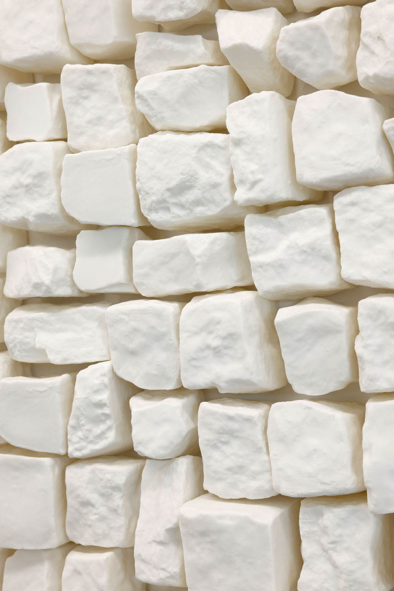
In almost every Berlin neighborhood they lie fastened to the street: mosaic paving stones that, loosened and lifted, sometimes serve other, tangible purposes. Ute Essig's work "Ein Viertel Berlin" now shows the stones as porcelain casts - the solid objects thus become fragile, moreover pure and smooth. Placed hanging on the wall, the stone replicas become urban relief, their fascinating surface can be reflected in the white porcelain cast.
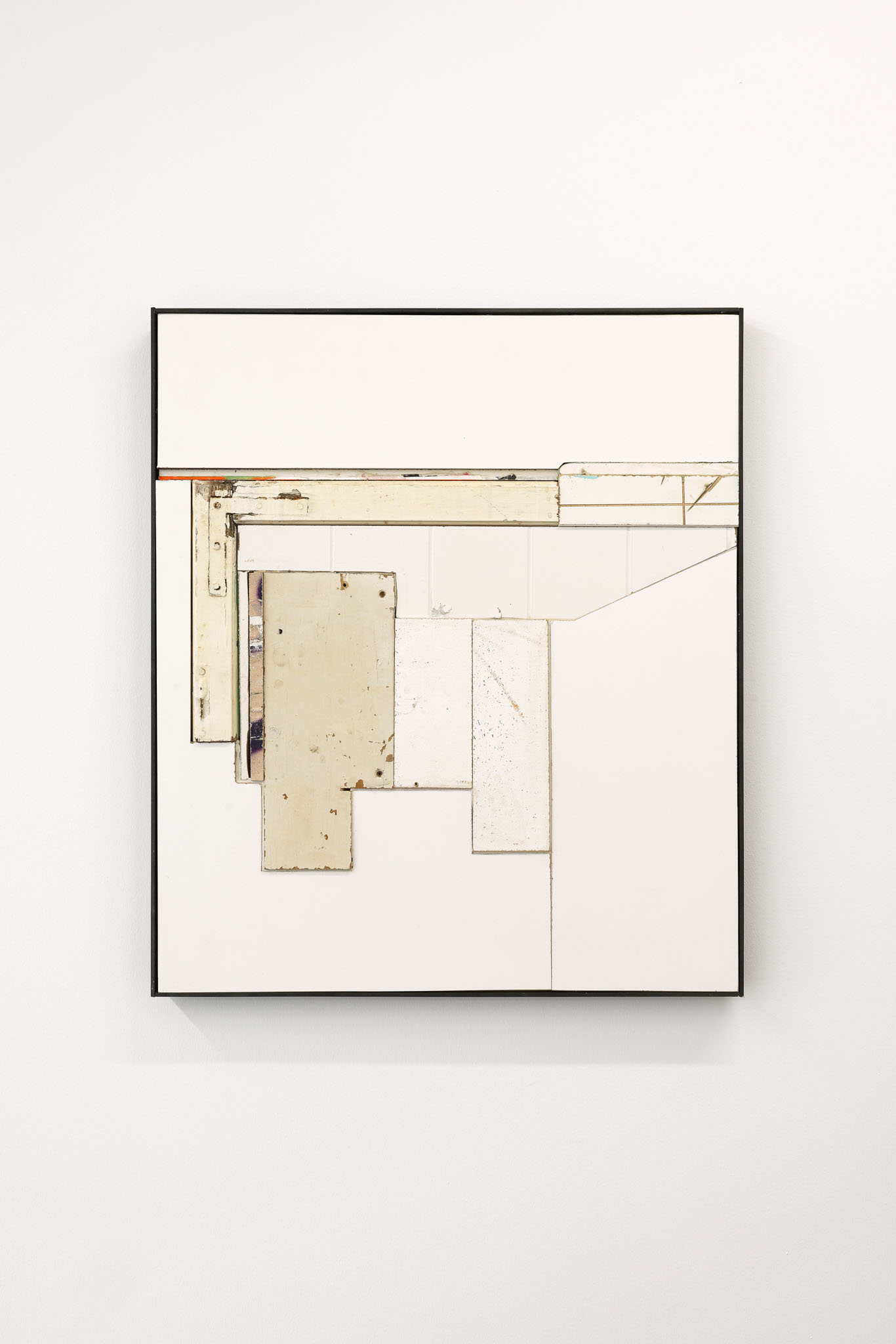
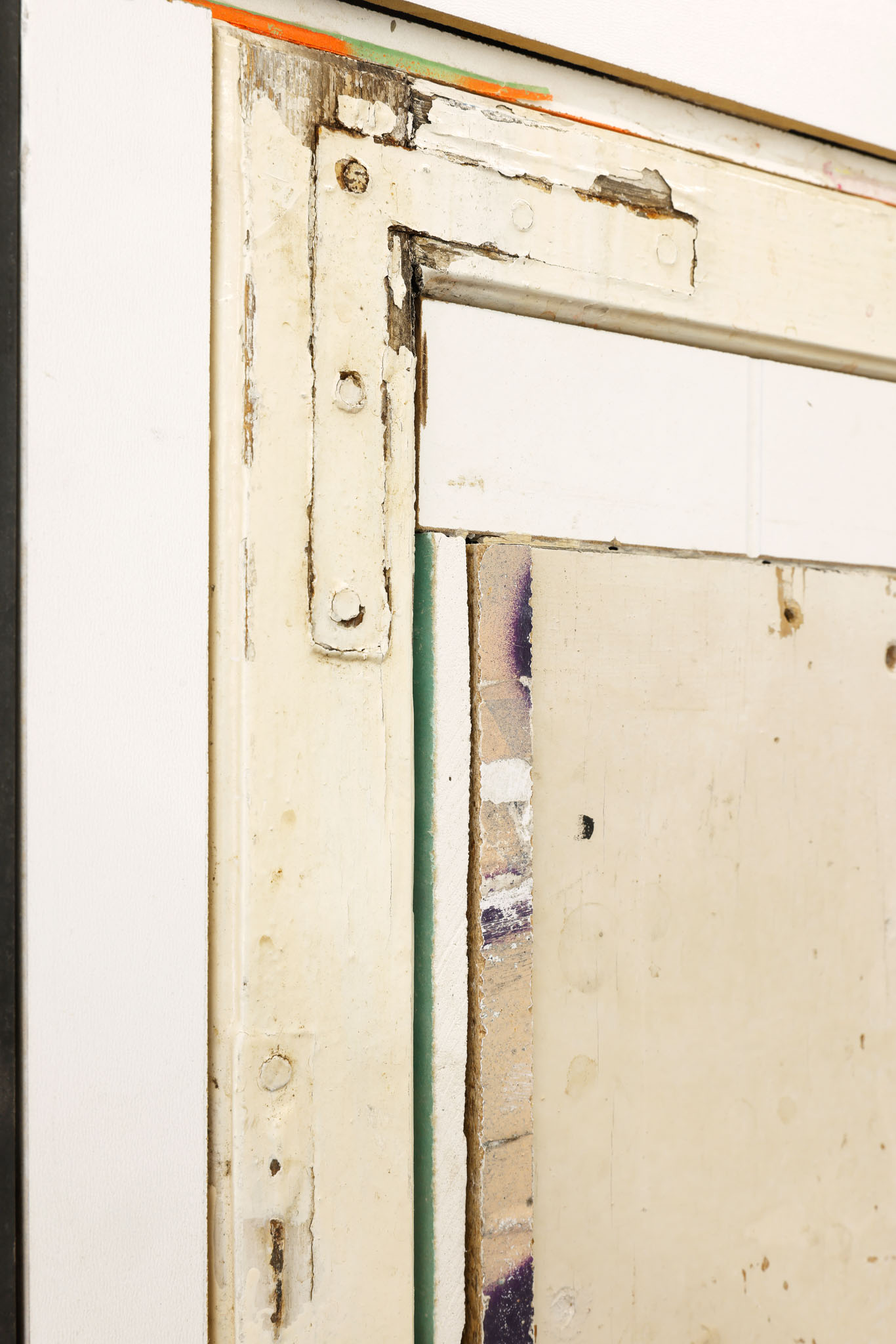
If we take Bram Braam's tableau "TO CONVERT A PLACE INTO A STATE OF MIND," made of tile, paint, steel, and wood, at its word, the question immediately arises whether the "place" means the relief-like surface in the picture frame, or whether the acquired state of mind, starting from the picture, has grasped the place of its presentation. In the case of Braam's work, we would then speak of states of reconfiguration, of tactility, of reappropriation, of spatialization.
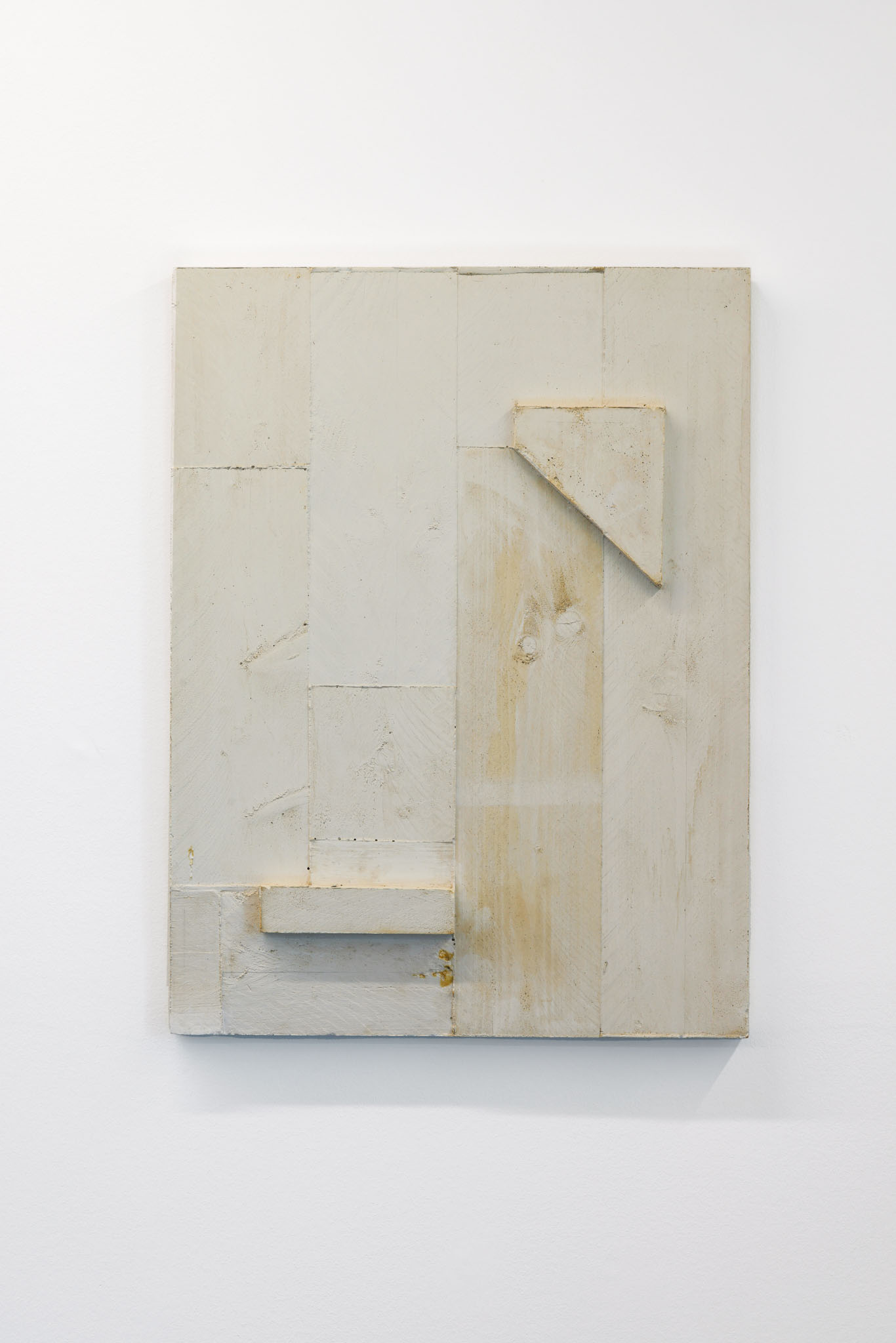
Eva Berendes' untitled plaster relief comes from an ongoing series of works produced in the same way and seeming similar to each other. They are characterized by the fact that they expose their production process by making visible the imprint of the wooden plates in which they were cast. Thus, the outlines and structures in their gracefulness correspond more to the characteristics of a casting mold for plaster, negative and positive thus seem to be interchanged. Significant, too, are the elements that form the picture doubly into a relief: like leftover remnants or additionally attached parts of a larger whole, they complete the work into a fragment.
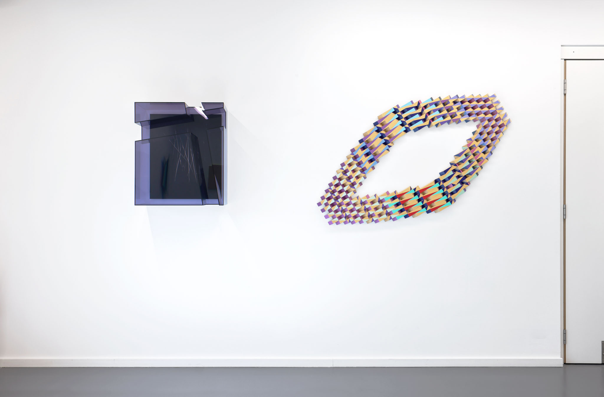
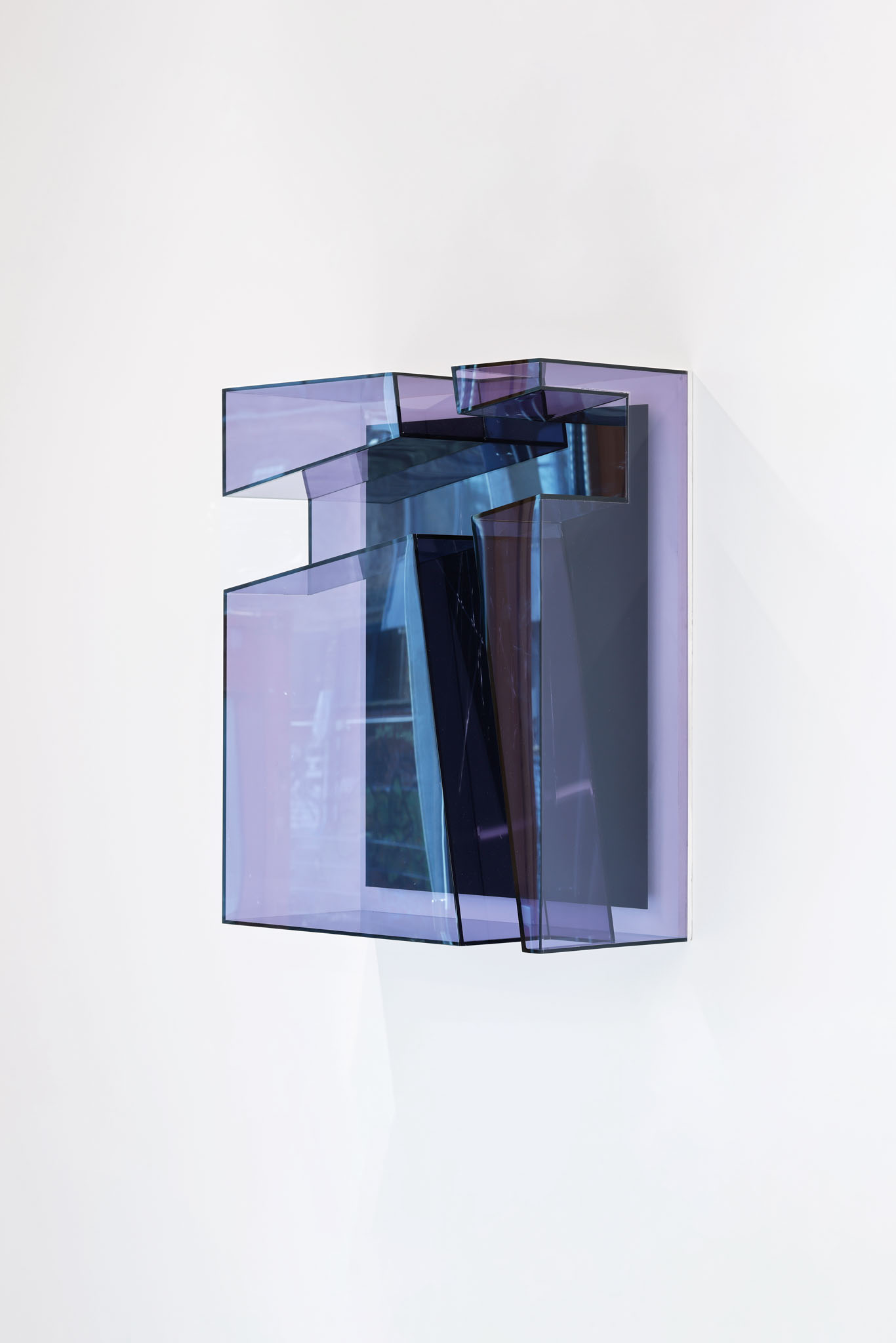
Dieter Detzner's works often function as a conundrum: what is the inside of the work, what is its outside, what is the frame, what is the image, what is two-dimensional, what is three-dimensional? The properties of his preferred materials - acrylic glass and mirror glass, for example - help him puzzle. Detzner's irregular, yet formally well-defined work "DD11B02", which projects into the room, also opens and closes at the same time. The riddle remains.
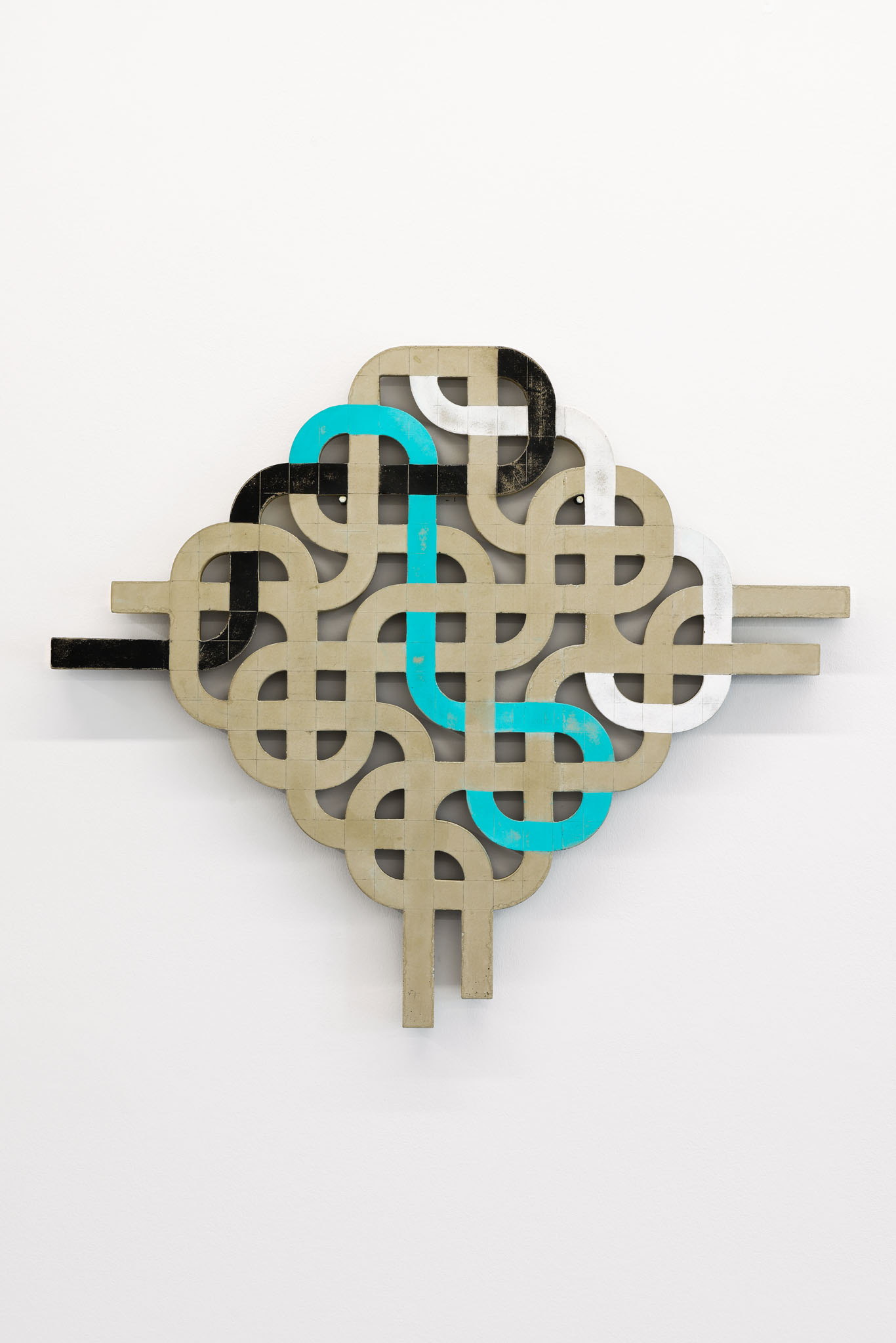
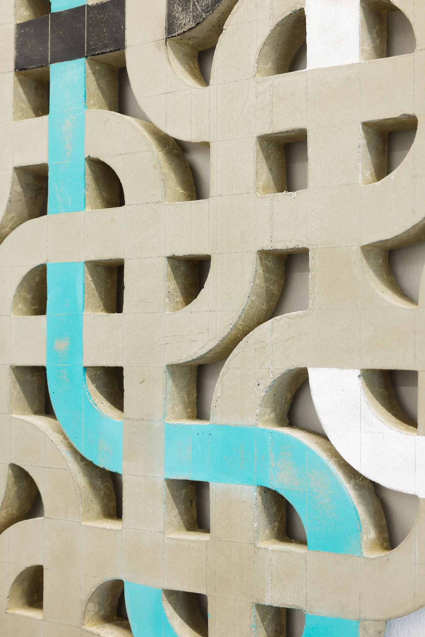
The concrete relief "Repetitive Structure No.2" by Susanne Piotter with its regular forms is reminiscent of Celtic patterns or an ornamental logo. At the same time, the cast and thus distinctly plastic structure, through the coloring of the individual "lines," also brings to mind illustrations from the realm of infographics, such as the network map of the Naples subway system, in which one line makes a loop. In the balancing act of difference and repetition, however, these colored lines and curves also lead us into the uncertain. Is the structure really repetitive, as its title suggests, or does it lead us - with a sixfold option to jump off - astray?
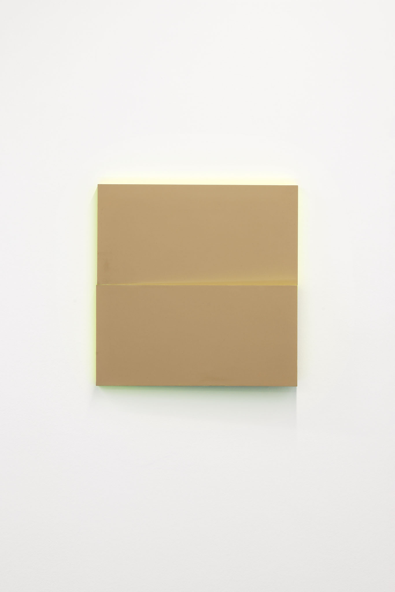
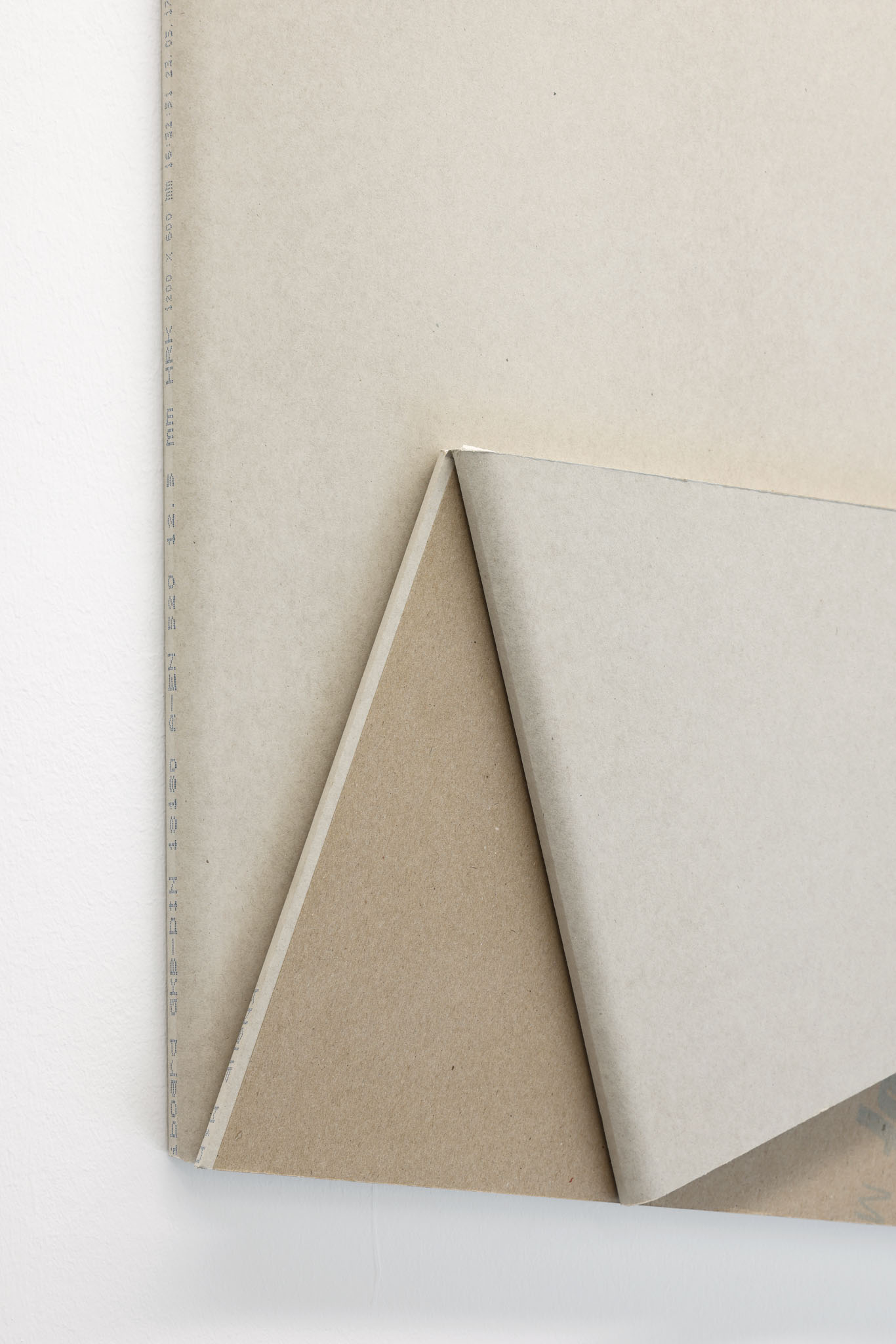
Cécile Dupaquier's artistic practice is based on the processing and modification of simple building materials. In "Miniboard n°5", a plasterboard takes on an almost poetic dimension through double folding. Playing with the shape of the object and colorings of the material, the work, on the cusp of a commentary on minimalism, oscillates between trompe-l'œil and origami.
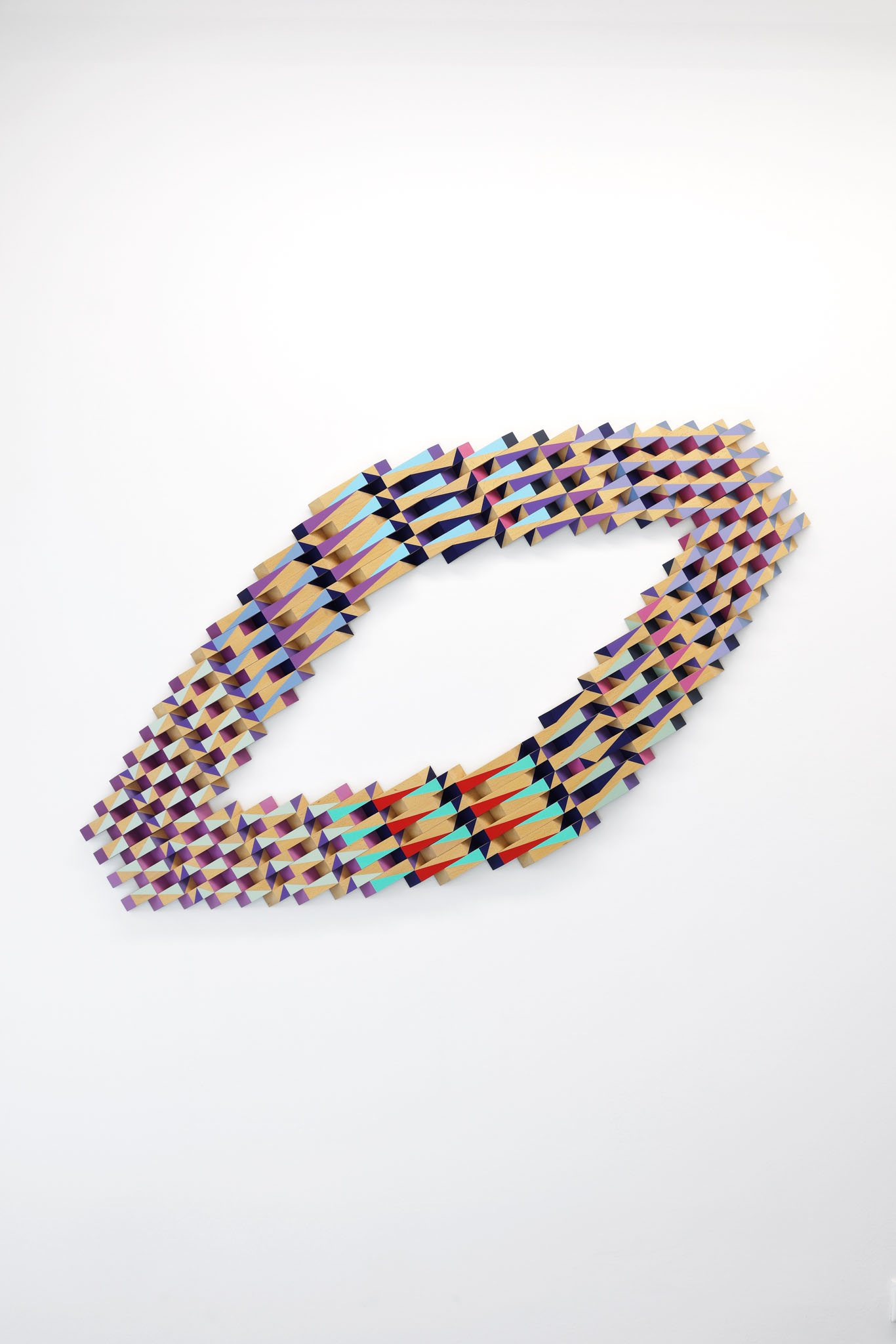
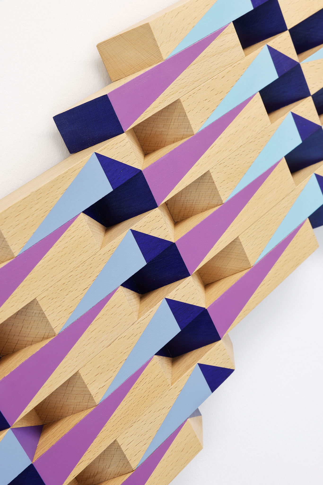
The wall sculpture "Progression of Color" by Maria Muñoz condenses abstraction into perspectives on a circling yet ever-changing perception. Does one see a flat rhombus or a "zero" lying in space, a ring - a loop? The relief structure and the surfaces of the modules made of oak wood painted in different colors support and intensify the play of colors and forms.
Michael Laube's wall work "08-20, 2020" is a play of space and surface. If the lines and shapes painted with acrylic show a certain severity, this is nevertheless softened by the difference of colors - but above all by the spatial depth of the pictorial object, which suddenly gives free rein to the architectural imagination.
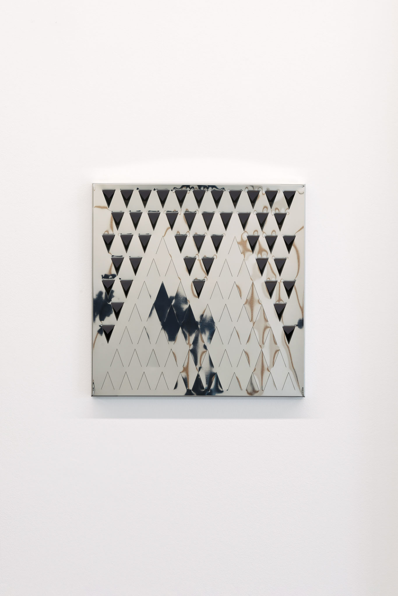
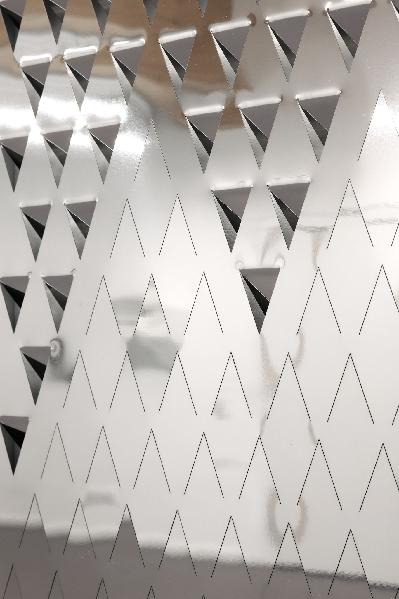
In her works - often wall reliefs - Amalia Valdés investigates, among other things, geometric and space-producing aspects of grids. In the encounter with her works, which are here matt, there shiny, then reflective, the viewers become active observers who perceive changes in form, color, and light according to their perspective and the position of their bodies - as in her "inverted" mirror relief "Morgenstern," which expands space into an "inside."
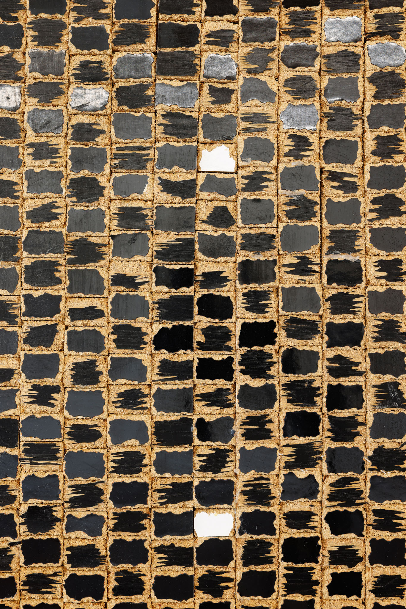
Karsten Konrad's work "monolith II" standing in the room seems to be a reference to Stanley Kubrick's film "2001", in which the black, extraterrestrial monolith stands as the origin of our civilization, unfathomable to us. Here now, almost unfathomably, a piece of tubular steel furniture originally labeled with the characteristics of modern pragmatism has dysfunctionally become a sculpture, to which the black formica surface in particular, which has been transformed into a relief, refers.
The B-Part Exhibition space accompanies the future development of the Urbane Mitte Am Gleisdreieck with artistic autonomy and thus at the same time enters into a dialogue with the overarching themes of the overall project - forms of New Work, Co-working, Culture and Sport - and creates synergies between artistic, cultural and social approaches. The artistic director of the B-Part Exhibition is Rüdiger Lange (loop - raum für aktuelle kunst).
