
Unverfänglich
Konkret
Katrin Bremermann
Angelika Dierkes
Kiki Gebauer
Franz Küsters
Doris Marten
Maria Muñoz
Klaus-Martin Treder


| |
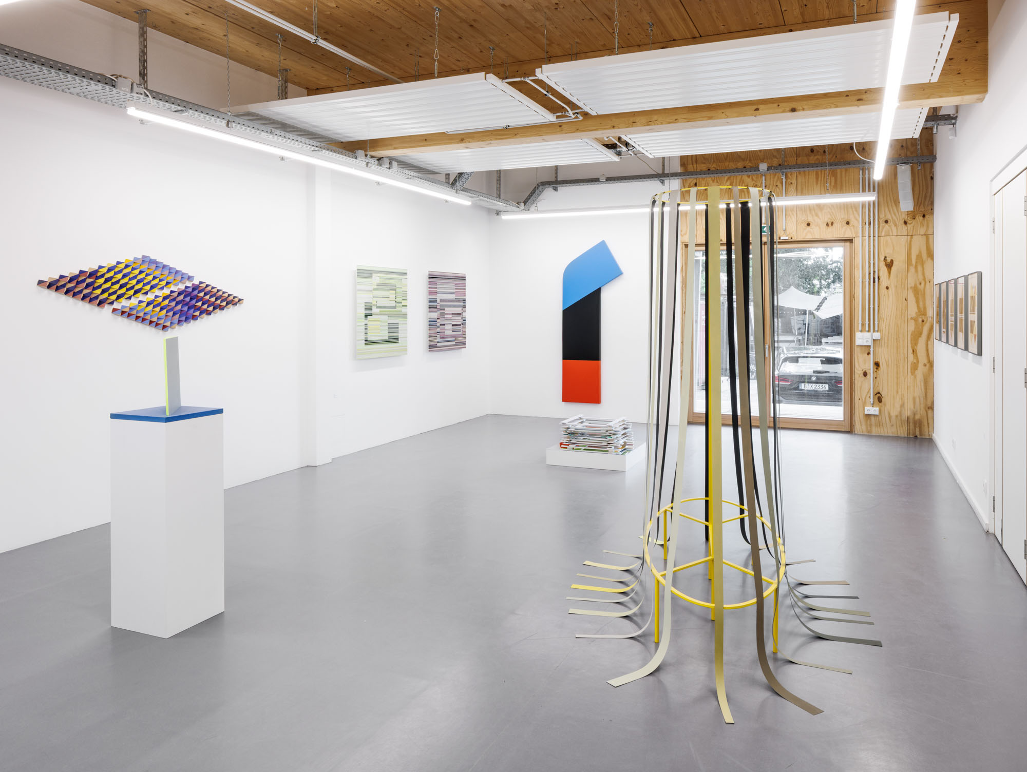
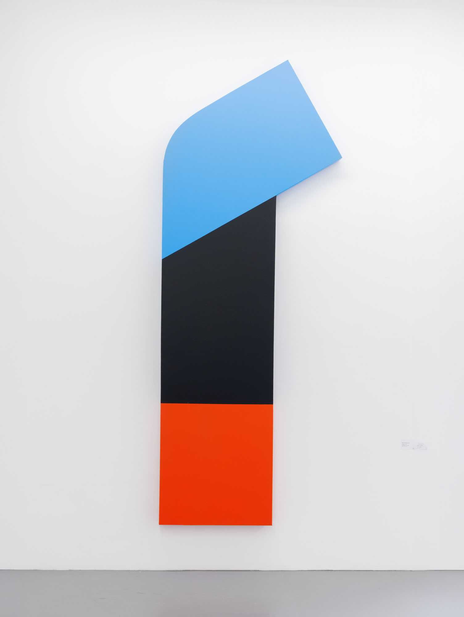
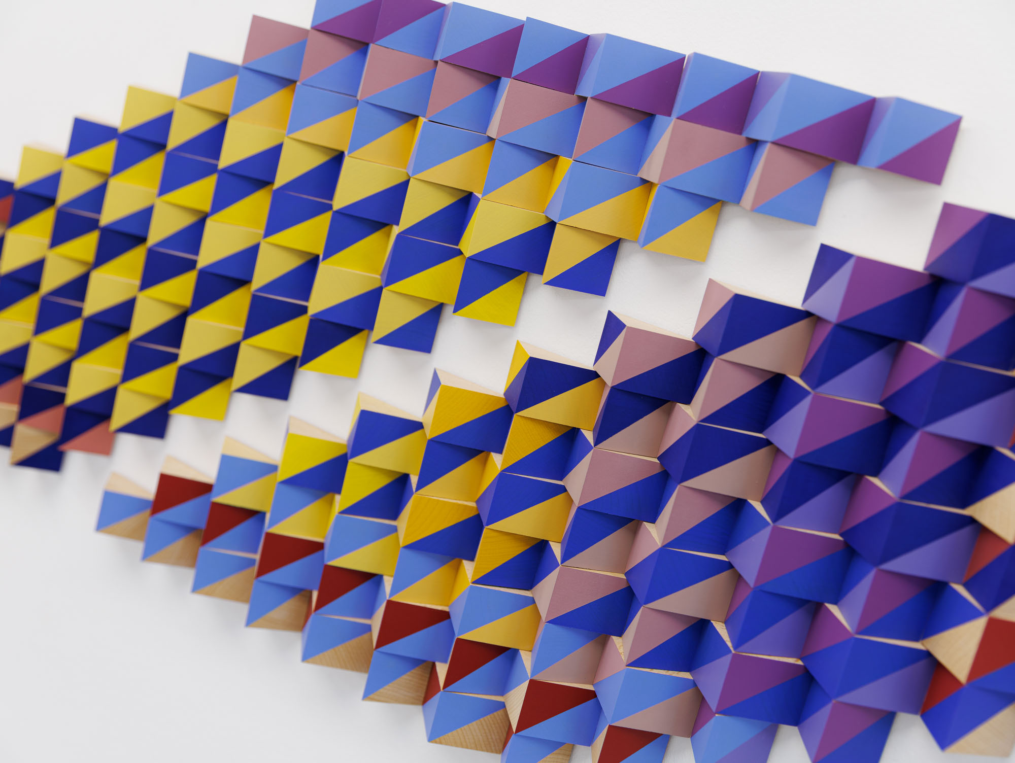
Katrin Bremermann's large-format work, created with acrylic paint on canvas, moves between painting and object. With clear geometric shapes and high-contrast surfaces in red, black and blue, she creates an exciting composition. The angled, rounded upper surface breaks through the rigid rectangular format and lends the work a dynamic, sculptural quality. The colors are reminiscent of concrete art; they do not stand for emotion, but for autonomous visual power. With its reduced but precise formal language, the work demands active engagement. It transcends the classic boundaries of the panel painting and anchors itself as an object in space. In doing so, Bremermann draws on well-known positions from Minimal Art or Concrete Art, for example, but formulates her very own language. Her works address the relationship between surface, color and space and show how minimal means can be used to achieve maximum effect.
The two-part wall piece “Densidad del Color IV” by Chilean-born Berlin artist María Muñoz comes from her series of the same name. The object, whose two parts can be positioned in different, flexible ways in relation to each other, also has a different color gradient. The relief, whose structure is reminiscent of woven textiles that can sometimes be read as “indigenous”, surprises in its sculptural form with different shades of color. Depending on the viewer's position in the room, different color impressions arise, which are also spatial impressions: due to the sculptural concept and the plasticity of the object, the colors take on different densities in different places, thus varying the atmosphere that the work creates.
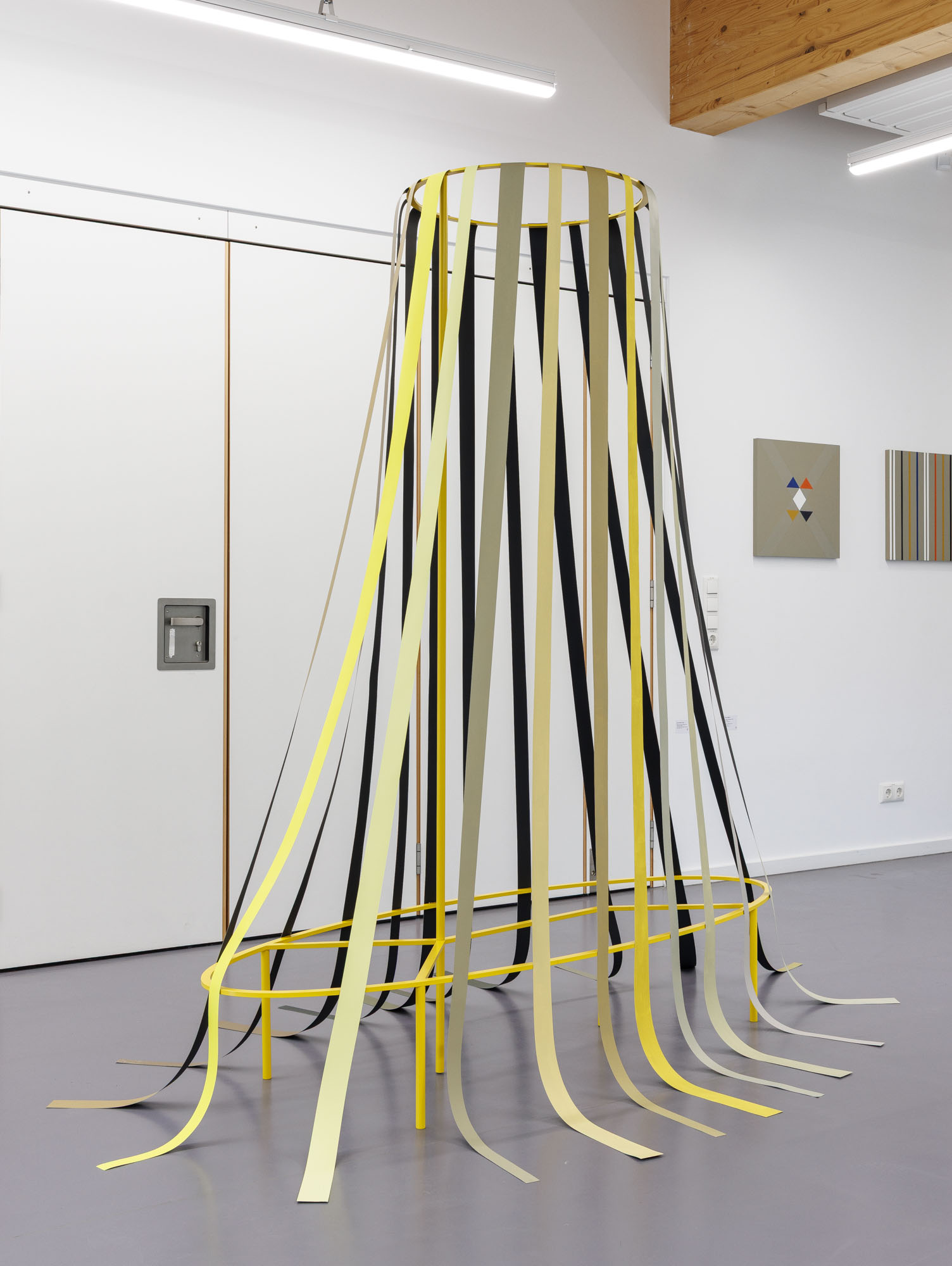
Klaus-Martin Treder's sculptural works require movement in the exhibition space. With his “Object 12” (2014), consisting of paper and a painted, powder-coated steel construction, “Unverfänglich Konkret“ is showing a work from Treder's “Scene at Night” series of objects. Painted paper panels in nuanced shades of yellow, grey, beige and black hang down to the floor from a circular steel frame in yellow at the top, which becomes elliptical towards the bottom. Viewers are actively involved in the process of perception as they walk around the object, which is almost expansive at over two meters high. Their perspective changes from a bright, luminous to a darker, subdued side, from a “dayside” to a “nightside”. This movement brings about a transition from surface to space, from two- to three-dimensionality. At the same time, the relationship between part and whole becomes tangible. Color and space overlap, light and shadow cut the space into flowing bands. Finely graded differentiations emerge in the intermediate area, which are not only functional in nature, but also flirt with the viewer's emotional attributions and interpretations.
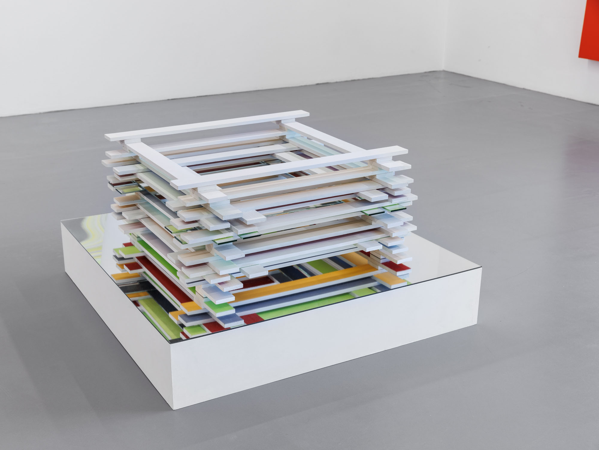
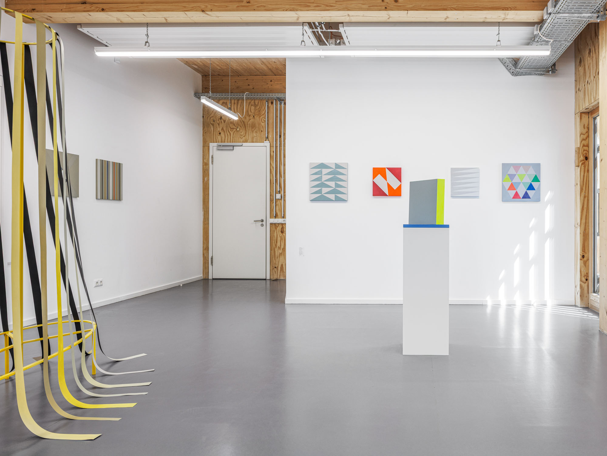
Kiki Gebauer's sculpture “Gestapeltes” rests on a cuboid pedestal with a mirrored surface. However, the calmness is deceptive, as the object consisting of many individual elements (wood, acrylic and mirror) seems to flicker with color impressions on closer inspection - both when viewed from the outside and from the inside, through the central opening. The effect is created by the fact that only the colored surfaces of the stacked, light-grey wooden elements point downwards, while the colors are only visible as reflections on the surface of mirrors inserted in place of the wood. The situation is similar even where no mirrors are inserted: here the light grey surface of the wooden elements reflects the color “floating” above it in a different, more subtle way. As the material difference between these two differently reflecting surfaces is hardly recognizable as such even at second glance, the result is an irritating perception, which must also constantly realign itself as the incidence of light in the exhibition space varies.
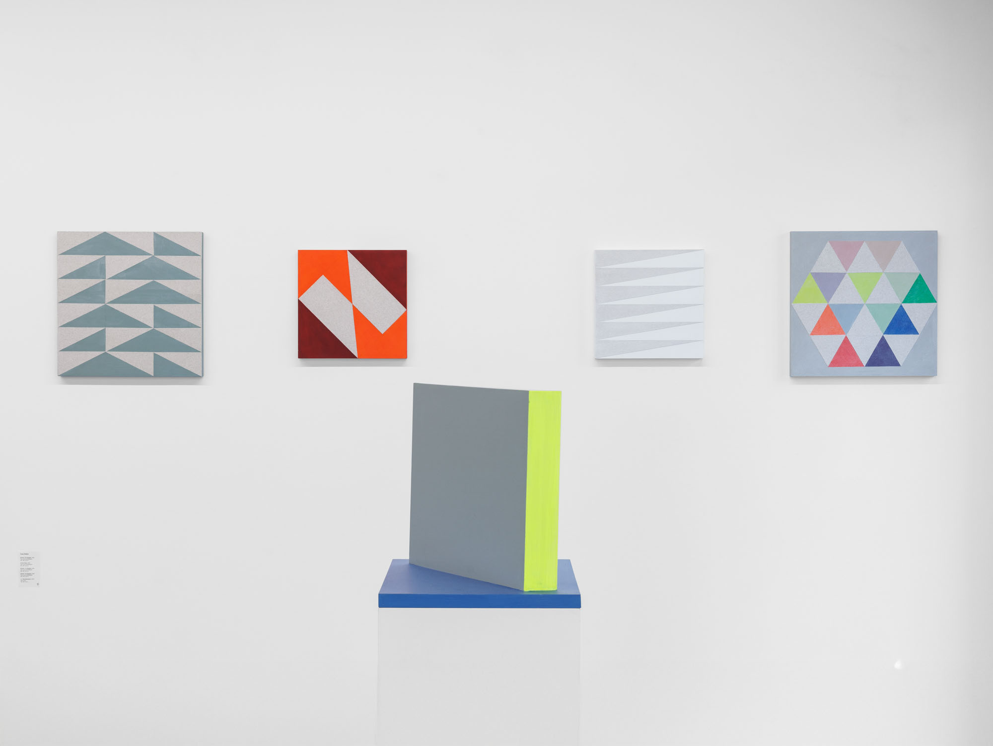
The works from Angelika Dierke's “Ancient Wording” series (graphite and acrylic on paper) are characterized by formal rigor on the one hand and open configurations on the other - which is reinforced by the hand-drawn elements that connect surfaces. The works in the series draw their inspiration from geometric patterns and ornaments handed down from numerous ancient cultures. In their visual languages, the use of elementary shapes such as squares, triangles and rhombuses often resulted in impressive testimonies to human creative power. Their simple clarity and symbolic density still fascinate today, as they make it clear why the effect of universal forms is timeless. The playful exploration of these forms constantly opens up new possibilities for compositional development, the wealth of variations of which seemingly knows no bounds.
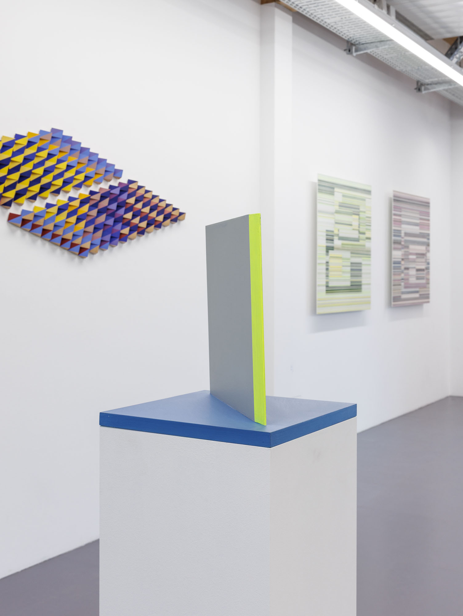
Franz Küsters (*1938) often moves between painting and object art in his work. The works shown at Unverfänglich Konkret are also the result of his continuous research into form, color, surface, light and shadow. They combine geometric abstraction with a sensual-visual variety in the sense of concrete art. The colors are powerful and rich in contrast, the forms are precise studies of their creative possibilities. Küsters' conceptual approach is based on a way of thinking in which seeing itself becomes an active part of recognition. Viewers are encouraged to move around the space, to adopt different perspectives in order to grasp the works in all their differences of color and form - and thus to directly experience the variability of the visible.
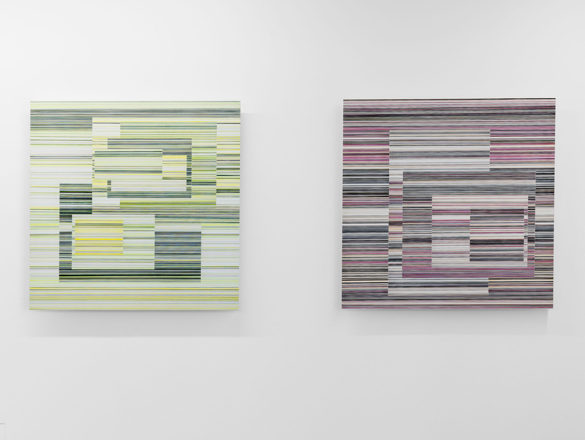
In her “Layers” group of works, Doris Marten focuses on the multi-layered effect of color. She examines how one and the same hue can be perceived differently depending on the color context. The finely tuned sequence of different colored lines not only structures the individual surface and gives it rhythm, but also influences the effect of adjacent elements and the overall composition of the picture. Using a ruler and an ink pen, Marten draws continuous lines about one millimeter thick on Alu-Dibond panels - without leaving any marks. This creates clear, constructive color structures in their most elementary form. The colored lines form square or rectangular areas that fill the picture field. The forms overlap, penetrate or intersect each other, but always remain within a strict grid of horizontal and vertical alignments. Each work in the series is based on exactly seven shades of color - a deliberate limitation for Marten, which, quite innocently, allows for variety on the one hand and avoids arbitrariness on the other.
The B-Part Exhibition space accompanies the future development of the Urbane Mitte Am Gleisdreieck with artistic autonomy and thus at the same time enters into a dialogue with the overarching themes of the overall project - forms of New Work, Co-working, Culture and Sport - and creates synergies between artistic, cultural and social approaches. The artistic director of the B-Part Exhibition is Rüdiger Lange (loop - raum für aktuelle kunst).